-
• #402
-
• #403
Oriel Chambers in Liverpool
that is really amazing.
-
• #404
It could do with better proportions
Can you explain what you mean by this or is it just your intuitive feeling? I find it odd when people talk about 'good' and 'bad' proportion.
-
• #405
I bet at the time there was a bit of resistance. (I'm not a fan myself)
-
• #406
I wouldn't change a thing about King's. I work on Chancery Lane so see it daily and I'm not sick of it.
-
• #407
I think it's proportion is just.
-
• #408


In and around Lincoln's Inn/New Square is one of my very favourite parts of town to experience the atmosphere architecture contributes to.
-
• #409

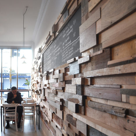
great use of off cuts
-
• #410
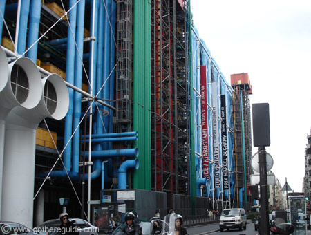
I want to give a shout-out to the Pompidou Centre in Paris, which is in my opinion one of the truest modern masterpieces and just epic in terms of intent and realisation. Not exactly my flavour-of-the-month aesthetically, but this is almost beyond aesthetics. It's an awesome hulk.


-
• #411
It's definitely interesting, but can be ugly depending on which elevation you're looking at, such as the bottom image for me
-
• #412
It's just so incredibly unique and has a really great presence. I agree about the bottom image; I always thought the entrance was its worst point. I just think it's iconic in the most worthwhile and triumphant way possible, unlike a lot of the shaped excrement that has popped (pooped) up since. And let's not forget this was finished in 1977!
-
• #413
Probably my favourite building in Nottingham, it stands out so well from its surroundings. I really do know nothing about architecture, I just love seeing it.
Newton Building, Nottingham Trent Uni

-
• #414
Know it well. Lived there for years. My Dad used to teach there, not that campus though.
-
• #415
i like the other side with the pipes

-
• #416
Can you explain what you mean by this or is it just your intuitive feeling? I find it odd when people talk about 'good' and 'bad' proportion.
The ground floor is too low, and insufficiently distinguished. The building is top-heavy as a result and unbalanced. Mind you, it's still a lovely building!
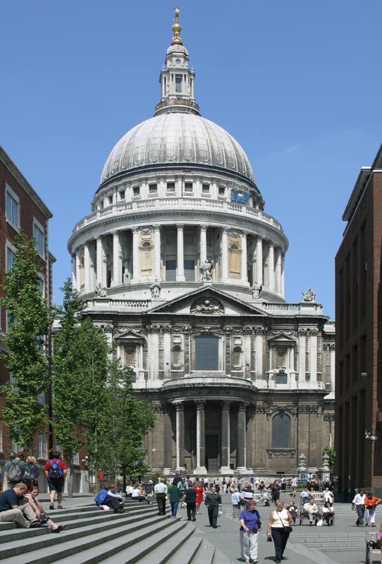
While it's an unattractive and exclusionary fortress in terms of its basic function, the proportions of the Bank of England are my second favourite in London after those of the dome of St Paul's:

(It's really hard to get a decent view of the Bank because of its location.)

I think the dome of St Paul's is the greatest architectural masterpiece in London (and way better than the dome of St Peter's in Rome), followed by the clocktower of the Palace of Westminster.
-
• #417
I took this pic of Pompidou last year.
Love the building
-
• #418
Agreed, the road elevation of the Pompidou centre has got to be its most unashamedly iconoclastic. No fucking windows and colour-coded service ducts as ornament. Well fuck me dead.
-
• #419
Necrophile.
-
• #420
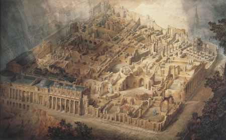
Oliver, have you seen John Soanes drawing (not actually rendered by him) of the Bank of England? It's out of this world. Obsessed with Piranesi and ruination as he was, he had his design illustrated as a ruin, where fallen walls provide cutaways that reveal the spaces within. Brilliant it is.
-
• #421
Yes, I have. I love the Museum.
The draughtsman he used was unbelievable.
The BoE as it is today is of course not to Soane's original design, but I like its present condition better.
-
• #422
I also love building floorplans and have drawn a lot myself. They probably fascinate me even more than actual pictures of buildings. This is great, showing the complexity of the BoE very nicely:
http://www.soane.org.uk/boe/index_1788.cfm
http://www.soane.org.uk/boe/index_1804.cfm -
• #423
Oliver, have you seen John Soanes drawing (not actually rendered by him) of the Bank of England? It's out of this world. Obsessed with Piranesi and ruination as he was, he had his design illustrated as a ruin, where fallen walls provide cutaways that reveal the spaces within. Brilliant it is.
This is it, by the way, and the draughtsman's name was Gandy:

-
• #424
Wow
 andy.w
 sohi
sohi StandardPractice
 Ordinata
 TheorySwine
 coppiThat
 nauls
nauls Oliver Schick
 nuknow
Oriel Chambers in Liverpool is one of my very favourite buildings:
Built in 1864 and predating modernism by about fifty years, it uses a modular, prefabricated walling system of glass set in cast iron with stone mullions. The ornamentation has an order, but one which is repetitious in an applied 'pattern' rather than in a classical, faux-constructional, vertical way. It's really glassy and transparent for it's age and has lasted really well. The courtyard, of which there seem to be hardly any decent photos, is even more spectacular, being walled entirely with tall, thin piece of glass set in (i think) lead. It's way ahead of its time, though its architect Peter Ellis only seems to have built this and another quite different but equally as unusual building just around the corner. It's all very mysterious actually and the building still doesn't garner much attention from scousers. More photos:
Here's the wikipedia link:
http://en.wikipedia.org/wiki/Oriel_Chambers