-
• #35327
Strangely, i like this
Strangely?! That is fucking beautiful.
-
• #35328
really like those last 2
-
• #35329
Strangely?! That is fucking beautiful.
I knew i was doing something right
-
• #35330
It is now my desktop background.
-
• #35331
Probably repost, but this is a textima

-
• #35332
Strangely, i like this
First time I've seen the Scapula looking as though it belongs there.
-
• #35333
A set of lightweight wheels would compliment the top build - I mean the fonts would pretty much match the forks and cranks.
Anymore info on the top bike its fucking lush right down to the use style integrated seatpost.
-
• #35334
^ gump
Howdy Trix!
-
• #35335
^ gump
F off!
-
• #35337
Oh, and it's 5.3kg
-
• #35338
What if the Leightweight logo filled the whole rim like a lot of others do? I think that would work. I think it's better than logos like Edge. Oooo it reads the same upside down. So what it looks rubbish. Can anyone potatochop it? My skills on paint don't quite cut it.
-
• #35340
I think it's better than logos like Edge
Edge is now Enve in Europe

1 Attachment
-
• #35341
Doesn't make the logo any better for me tho. I think 5 logos per rim would help but not a lot. Don't know why but on rims that deep I kinda like the whole rim to be covered or no logo at all, depending on the bike. No logos for lugged frames of course. :)
-
• #35342
BMW Makes some of the best, and most innovative frames out there - to call them crap show a complete lack of understanding of anything to do with frame design or manufacture
My objection to the road frame is that the only reason to buy it over another similar spec frame is that its a BMW - From what i understand that frame is a one off only.
Its not porn, but no doubt a decent frame.
that's pretty much what attract me to the BMW road frame, the fact that it's a BMW road frame itself, which is my only reason really (beside the obvious reputation).
-
• #35343
textima or not. doucheratie rims suck balls. PDM is one stunning history, a real Team frame!
-
• #35344
They all look like they want to urine on each other.
-
• #35345

Ive just creamed myself.
that is all
-
• #35346
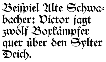
Bavarian? Not really. It's in an italic (as in Italian/Latin) cursive pen style rather than a Germanic blackletter style:

The red type on the left is considerably more German, being DIN (Deutsche Industrie Norm, the typeface used on German road signs etc.).
I personally have no problem with it as a logo, by the way (apart from finding it ugly), the point I was making is that it's an illustration of how much we expect a slick, technical-looking logo on stuff. Especially bike kit.
you're too clever for them Regal. i'd give up if i were you.
-
• #35347
](http://img818.imageshack.us/i/maxcroweposter.jpg/)
Uploaded with ImageShack.us
-
• #35348
What if the Leightweight logo filled the whole rim like a lot of others do? I think that would work. I think it's better than logos like Edge. Oooo it reads the same upside down. So what it looks rubbish. Can anyone potatochop it? My skills on paint don't quite cut it.

It's just a shit font and a terribly plain logo.Could have easily been fixed using a bit of WordArt, since they were in Word anyway..

-
• #35349
Could have easily been fixed using a bit of WordArt, since they were in Word anyway..

I hope that was a joke?
They're a pair of top class wheels, not a fucking ten minute wedding chapel in Vegas! -
• #35350
All you haters who think the Lightweight branding is too plain, do you think this is an improvement?

And you contribution was?
I don't recall "make a failing attempt at whitty backtalk" being an option. Again, post bikeporn or gtfo if you don't want to partake in the conversation, cause nothing much is coming from you on this page either.
 MaxC
MaxC TM
TM nuknow
 gbj_tester
 bmxconan
 Chris_Borneo
 samdaniel
 edscoble
 no*dice
 eddie
eddie Squoocher
 Yan
Yan Björn
Björn TheFinalHour
 @Velocio
And this...
http://farm5.static.flickr.com/4082/4931912042_a7cd9087d1_b.jpg
silly wheels