-
• #35277
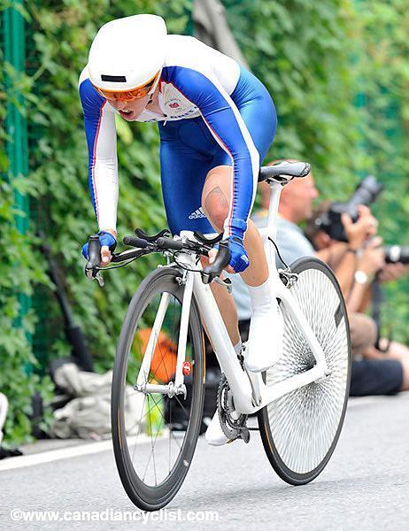
what kind of bike is that lightweight thing anyways
Commuter.
Difficult to see the mudguard and rack mounts on that pic granted.
-
• #35278
i can't get over how amateurish the font is that Lightweight insist on using on their rims. Seriously. What is it, just lifted off Microsoft Word? And to think they probably spent thousands of dorrahs trying to find "just the right logo to project our brand image". Sweet Jesus.
steps off soapbox
sexy bike though.
I like it.
-
• #35279
what kind of bike is that lightweight thing anyways
Looks like it's on the Puky stand
-
• #35280
When you're doing 40mph+ through banked corners behind a moto while perched on the nose of the saddle, the last thing you want is for it to slip its mooring on the seat post.
Understood. Why are they not used anymore?
-
• #35281
The Lightweight logotype is amateurish, and quite ugly, but I do find it funny when people positively demand a slick corporate logo on products. "It's just not calculated enough for me. How am I supposed to know that I fit into their target demographic? Other people might mistake me for a consumer who buys poorly marketed goods when in reality I have a highly developed taste in corporate branding."
-
• #35282
Lightweight type logo isn't amateur at all.
We are talking about it? Do you ever confuse it with another wheel? No. It's clearly acheived its intended purpose very well.
Your an amateur regal for thinking it's amateur
-
• #35283
Amateurish, in that it's been typed out using a very default-looking font rather than having been crafted as a bespoke logotype. It works as a logo in that it's distinctive and they use it consistently.
I am pro.
-
• #35284
The Lightweight logos are a complete fail in graphic design, it's like having Papyrus as your company logos.
However, the awful typeface now feel like part of the Lightweight logos and I don't think they should get rid of it anytime soon, it's bad but it's a typeface that's recognisable as a Lightweight one.
-
• #35285
Amateurish, in that it's been typed out using a very default-looking font rather than having been crafted as a bespoke logotype. It works as a logo in that it's distinctive and they use it consistently.
I think it works fine. It's simple which is why it works so well.
It doesn't need to be flashy or a nice font, its a brand name but also a simple statement:
This wheel is lightweight, something you can't argue with.
Its a very very good logo. One that you would never consider changing. -
• #35286
I think the logo is a reflection of Lightweights bavarian roots. Also it puts the emphasis on the product rather than the branding.
-
• #35287
Looks like Rogul Dorn's Imperial Fist battle fixie.
- is ashamed to say I know what you're talking about and I thought the same thing too. It should be yellow though!
- is ashamed to say I know what you're talking about and I thought the same thing too. It should be yellow though!
-
• #35288
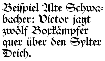
Bavarian? Not really. It's in an italic (as in Italian/Latin) cursive pen style rather than a Germanic blackletter style:

The red type on the left is considerably more German, being DIN (Deutsche Industrie Norm, the typeface used on German road signs etc.).
I personally have no problem with it as a logo, by the way (apart from finding it ugly), the point I was making is that it's an illustration of how much we expect a slick, technical-looking logo on stuff. Especially bike kit.
-
• #35289
The lightweight logo is not a fail - its the perfect logo for a company that is all about light weight minimalist components.
Some big fuck off logo like most companies go for would be a fail.
It may not be the best logo ever, but then again lightweight don't need a cool logo to sell their products.
I don't know fuck about fonts, typefaces, whatever, but then again i guess most of their customers don't give a shit either
-
• #35291
a BMW roadie? want!

-
• #35292
Why? Youd only be buying that for the name over many other way cheaper alternatives
-
• #35293
Those Lightweight logos spend most of their time going around at umpteen million rpm. So it dosent matter what they look like.
-
• #35294
and most ironically the paint/sticker used for the 'lightweight' text makes them weigh more.
Scoff, Chortle, Scoff -
• #35295

that gear shifter is AWSOME!
so are his sunglasses strings
-
• #35296
- is ashamed to say I know what you're talking about and I thought the same thing too. It should be yellow though!
It's Rogal Dorn.
But I, too, agree.
- is ashamed to say I know what you're talking about and I thought the same thing too. It should be yellow though!
-
• #35297
and most ironically the paint/sticker used for the 'lightweight' text makes them weigh more.
Scoff, Chortle, Scoff"10% smaller logos for reduced mass and lower turbulence at the rim"
Maybe that's why it's italic - more aero.
-
• #35298
ha!
-
• #35299

so it's official: anyone with a top tube pad is "special"
(Plus folk that post shit load of gash oldenmtbs :-)
-
• #35300
a BMW roadie? want!

fucking horrible looking bike.
Why anyone likes BMW bikes i really don't understand, they just build crap.
 Smallfurry
 nauls
nauls Dutch_Cheese
 mr_lunch
 Regal
Regal edscoble
 bmxconan
 lae
lae vinylvillain
 ewanmac
 jambon
 miller
 skunkworks
 Multi_Grooves
 @Velocio
There is, Lightweight are custom, AFAIK.