-
• #18927
I'm saying that the area isn't how it should be measured, exactly because it's so much harder to gauge because of the stupid maths. The images I used are actually squares, if the white bits were filled in and used to represent the figures it would be correct, what makes it different because they are circles? They are still 41% or 3% of the size of the 100% even if the area isn't, and it's much easier for a layperson such as myself to immediately see the difference.
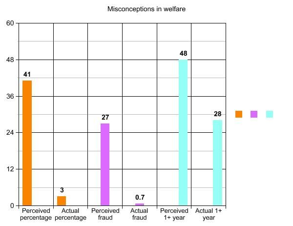
Bar chart then

Clunky as hell, but the contrasts are much clearer I think
-
• #18928
^^^you're right, they're not incorrect, but it is a failure by the designer to make the data as easy to understand as possible, if there was no original intent to do that then they would have just stated the numbers on the page and moved on. Also that link posted shows that research has found that people are likely to underestimate the area of circles and through that practice has been developed to compensate for this.
-
• #18929
Obviously, there are a myriad of ways (judging by a quick google search) to skin this particular moggy. The point is that using these circles is not a misleading way of representing the data, or that they were incorrect, as originally claimed.
Ok fine, they're not wrong, they're just obtuse.
-
• #18930
The images I used are actually squares, if the white bits were filled in and used to represent the figures it would be correct, what makes it different because they are circles?
Really??
100 x 100mm square is 10,000mm squared
41 x 41mm square is 1,681mm squared which is 16.9% of the size of the 100x100 square, not 41%
This is not rocket surgery.
For example;

The smallest square is half as wide/tall as the middle square but is 4 times "smaller"
-
• #18931
Ok fine, they're not wrong, they're just obtuse.
triangles, see?
-
• #18932
Pie anyone?
-
• #18933
The graph isn't asking people to judge the area of a circle. It's giving the percentage, so that's not necessary. It is offering a very simple visual representation of differences. That is all. And it works. I can very easily see that the relative difference of the first two is 'a lot' and the third 'not so much'. If you find it confusing you're thinking about it too much.
-
• #18934
This.
A big circle is bigger than another circle, which in turn is bigger than another.
Luckily the reader has the numbers in the circles, if they want the detail of it, and don't have to measure pixels to understand it.
-
• #18935
Pie anyone?
Yes please

-
• #18936
This ^ ^^^needs own thread?
Poll¿
42% yes
0.0007% no -
• #18937
I like the circles
-
• #18938
I like the circles
Filth!
Stop ogling those figures and go ride your bike.
-
• #18940
http://www.guardian.co.uk/music/2013/jan/08/david-bowie-new-album-single
sounds like he's in better voice than most of his contemporaries.
-
• #18941

You've got to love the irony though...
-
• #18942
a dredge regarding the whole circle/infographic debacle.
here's a doodle from my uni days:

by area works, people. -
• #18943
I'm confused, because I see the two circles as being arbitrary shapes used to represent percentages, which should be directly relative to the size of the hypothetical 100%
So say this 100x100mm circle represents 100% of the welfare budget:

This circle is 41x41mm: so is 41% of the size of the entire welfare budget, and the percentage that people perceive goes to unemployment benefits:

And this is 3x3mm: 3% the size of the 100% welfare budget, which is the actual amount spent on unemployment benefits

I agree with skydancer that two pie charts have been much more effective. Or even a bar chart.
I thought you were a designer?
-
• #18944
But where's Joe McElderry now, eh?
-
• #18945
Who cares?
-
• #18946
^^I don't even know who the people are/were, it was just a (sort of relevant at the time) table of numbers to me.
-
• #18947
They're PEOPLE, with FEELINGS and HOPES and DREAMS!
-
• #18948
the FUCK is wrong with people giving a fuck about flying a flag? total dickheads all of 'em, both sides - shame because Belfast is a great city
-
• #18949
They're PEOPLE, with broken FEELINGS and shattered HOPES and smashed DREAMS!
Except the one what won.
-
• #18950
http://www.bbc.co.uk/news/world-europe-20942340
Yay for the Dutch?
 Scoot
Scoot fade
fade stevo_com
 Lynchman
 H-Bomb
 dubkev
 skydancer
 Balki
Balki rpm
rpm Prole.
 6pt
6pt villa-ru
 handtightenonly
 Kidneys
 EB
EB Brun
Brun pete
pete @Platini
I am suffering some sort of bizarre syndrome where I assume everything I see comes from the Guardian. Anyway, there are other results in this poll that are worth reading about too
http://falseeconomy.org.uk/blog/tuc-poll-finds-that-support-for-benefit-cuts-depends-on-misconceptions