-
• #79702
The new scheme will look dated when the old one still looks classical.
-
• #79703
it looks better, we don't all want to pretend we are in the 80's still
so 70s instead?
-
• #79704
maybe, but who knows.. while the old one will look like an 80's bike the new one will look like a bike made in 2010. I personally would'nt spend money on a new-old looking bike just to satisfy some sort of l'eroica fetish
-
• #79705
Disagree with the majority here. The new one is lovely. Plus, House aren't really a design company per-se.. They are a type house which produces products so its interesting to see their work in this branding context (for me anyway). They are also a type foundry who sort of semi specialise in reclaiming and redrawing extinct typefaces and preserving American design culture (what there is) - with a similarly uncompromising approach to what they do - which makes the connection even more interesting.
There's a good post on the House Blog about the work they have done for the RS rebrand - I actually think its a respectful and intelligent piece of work, preserving just enough of it for it to be familiar, without throwing all the brand heritage out the window.
-
• #79706
Dilution?
Trollface.jpg
-
• #79707
The new scheme will look dated when the old one still looks classical.
Maybe.
Would prefer the old one. For the simple reason that this hue of red of the new design is so wack.
I mean, for a bicycle. Somebody said it was looking too soft for a cx bike, and you can put it this way,
I'd say it does not at all go well together with any 'serious' / 'classic' bike design.
Really, what the fuck where they thinking?
Looks like the enamel of an italinan coffee cup from the seventies or something.
Do not want. -
• #79708
Samson w/ Columbus Max fork
-
• #79709
we don't all want to pretend we are in the 80's
That particular ship sailed when he decided to make a bicycle frame from steel.
-
• #79710
I don't get it...
Am I missing something here?I agree. But doesn't this often happen? A bit like when they first completely redesigned the range rover and it looked the same... although at least there there's a bit more going on in terms of complexity.
I guess it would all seem less weird if he'd just said; "I want to spruce up the design and I think theses guys are pretty cool so I asked them to have a bash".
Still i dont think its all that bad. Especially if those amazing little ATD's are still there. . Mainly I'm not a fan of the new colour or tribal seat tube pattern but this pretty much sums it up:
The new scheme will look dated when the old one still looks classical.
-
• #79711
I love the new RS design. I loved the old design, love the new one.
-
• #79712
That particular ship sailed when he decided to make a bicycle frame from steel.

-
• #79713
That photo could not be any more Euro.
-
• #79714
looks fluro
-
• #79716
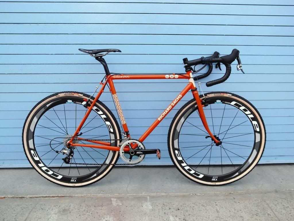
looks good but the wheels are too loud
-
• #79718
Steel frame with crabbon wheels makes me giddy.
-
• #79719

-
• #79720
SRS BRO? C'mon!
-
• #79721
Not bad but cut that steerer and wtf is a Cole?
The green Sachs looks like some Halfords window display shit.
-
• #79722
Green Sachs would be porn without the matching stem and shiny bartape- I hate that shit.
-
• #79723

-
• #79724
isnt cole evans trying to do posh weenie wheels ?
-
• #79725
Yes and no. Exclusive to Evans. But they're actually an American brand that's based in Taiwan. Apparently.
 gbj_tester
 sohi
sohi dan
dan Ordinata
 salad
salad charlesreza
 hugo7
hugo7 Verbs_&_Nouns
 erikjonsson
 Regal
Regal Nef
Nef B0N0R
B0N0R toby.d
 NickCJ
 jambon
 Tenners
 @Velocio
it looks better, we don't all want to pretend we are in the 80's still