-
• #53952
^decent track forks tend to have a large clearance for aerodynamics, to reduce boundary layer shear
Tight clearances were never about aerodynamics, because aerodynamics were barely considered in the days when tight was right. It was about shortening the frame members (fork blades and chainstays) to the minimum to achieve maximal stiffness within the unthinking constraint of invariant tube guages. There was also an erroneous belief that extreme shortening of the wheelbase yielded more appropriate handling characteristics for track racing.
-
• #53953
not necessarily.
Is there a secret im missing out on?
-
• #53954
fair enough about shortening the frame, but look at these massive gaps
http://www.stonehengecycles.com/images/stonehengecycle/isaac%20Track%20bike%20lrg.JPG
http://www.cyclingweekly.co.uk/imageBank/g/German_FES_track_bike_2010_world_track_championships_Copenhagen.jpg
http://www.spiukusa.com/dolan/03-track/pics/DF3-Sprint-420.jpg -
• #53955
That last one offends my visual sensibilities.
-
• #53956
Breaking about half the unwritten rules of this thread here. But saw this, this morning, and was blown away. I'd very much like to build an alu version of this. But that Flame fork is going to be darn pricey.


http://forums.mtbr.com/fat-bikes/sandman-goes-races-743968.html
-
• #53957
^ I like it.
...and of these I'd say the moser looks by far the worst.


The Boardman logo just isn't as nice.
Can't tell if it's the colour or what, but here it looks much better:

-
• #53958
SF - some wicked pictures in on that page.


-
• #53959
Ahaa! Holy shit, that's awesome ^
-
• #53960
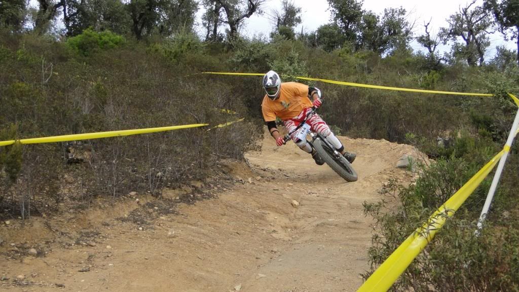
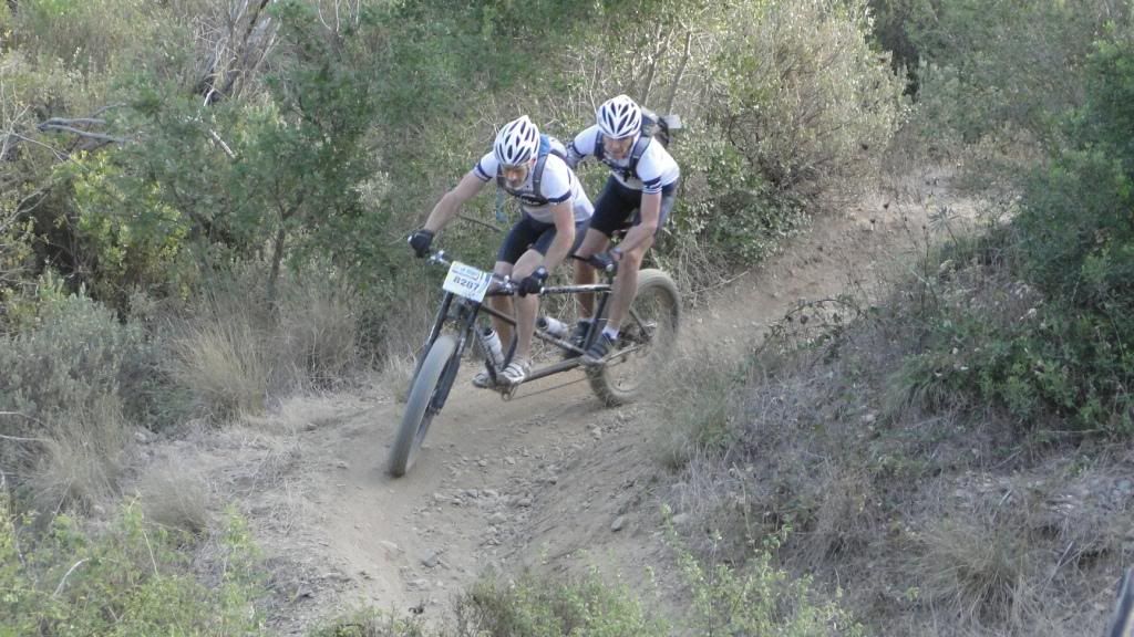
Downhill Fatbike tandem'in.
Proper niche.
There's some mad urban downhill pics too. Hopefull this means the website will be fully functional soon.
-
• #53961


The Boardman logo just isn't as nice.
that logo is in a box for what seems for thigns like websites, remove the box and it will look better. and without the tag line,
that said the masses of logo's on a bike is a product of there markets right?
thats why super cool minimal fixes for hipsters have minimal logo's, its what sells in the markets there aimed for,though bordman in halfords is bad, there still the best bikes in there right?
-
• #53962

I hope this isn't a repost.
-
• #53963
^love that
-
• #53964
Fuck ya. Which bars are they?
Re: the logos those were the only small examples I could find but my point was that in my opinion on the frames the Merckx and Moser logos look nicer regardless of whose names try are.
-
• #53965
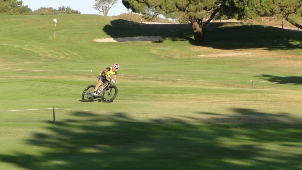
SF - some wicked pictures in on that page.

Proper usage of a golf course.
-
• #53966
nice sweet loving touch !!
-
• #53967
this is what cycling is !!

-
• #53968
give me strength

-
• #53969

-
• #53970
lol
-
• #53971
I imagine that tree talks with Kelsey Grammers voice.
-
• #53972
ha, good observation
-
• #53973

I hope this isn't a repost.
WOW! i looooooooooooooooooooove it!
-
• #53974
Don't think this ever got posted.

-
• #53975
Seen this before somewhere?
Love the forks.
 gbj_tester
 Sumo
Sumo 6pt
6pt Smallfurry
 hugo7
hugo7 Graeme_
 morgasm
 toby.d
 withered_preacher
 spotter
 dan
dan TheFinalHour
 noca
noca Ordinata
 @Velocio
my planet X carbon track forks had very tight clearance with 19mm tyres. Don't think they were made in the 70's.