-
• #59577
'the following fonts are missing...'
-
• #59578
That puts me right off buying one
-
• #59579
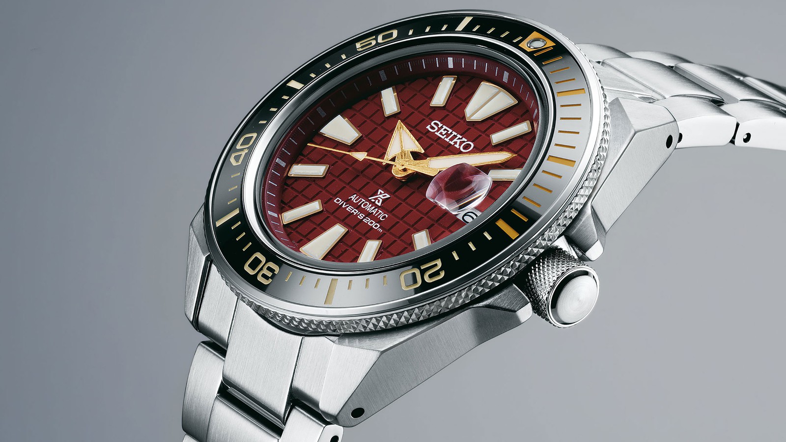
European exclusive Samurai LE looks quite nice if you like maroon and gold. £660.

-
• #59580
I know right, I'd have had one for myself and one for the wife if they'd had the good grace to buy a professional font.
-
• #59581
Ha! Yeah fair enough, was only messing and was just a generalisation. For the record I do rate Omega.
-
• #59582
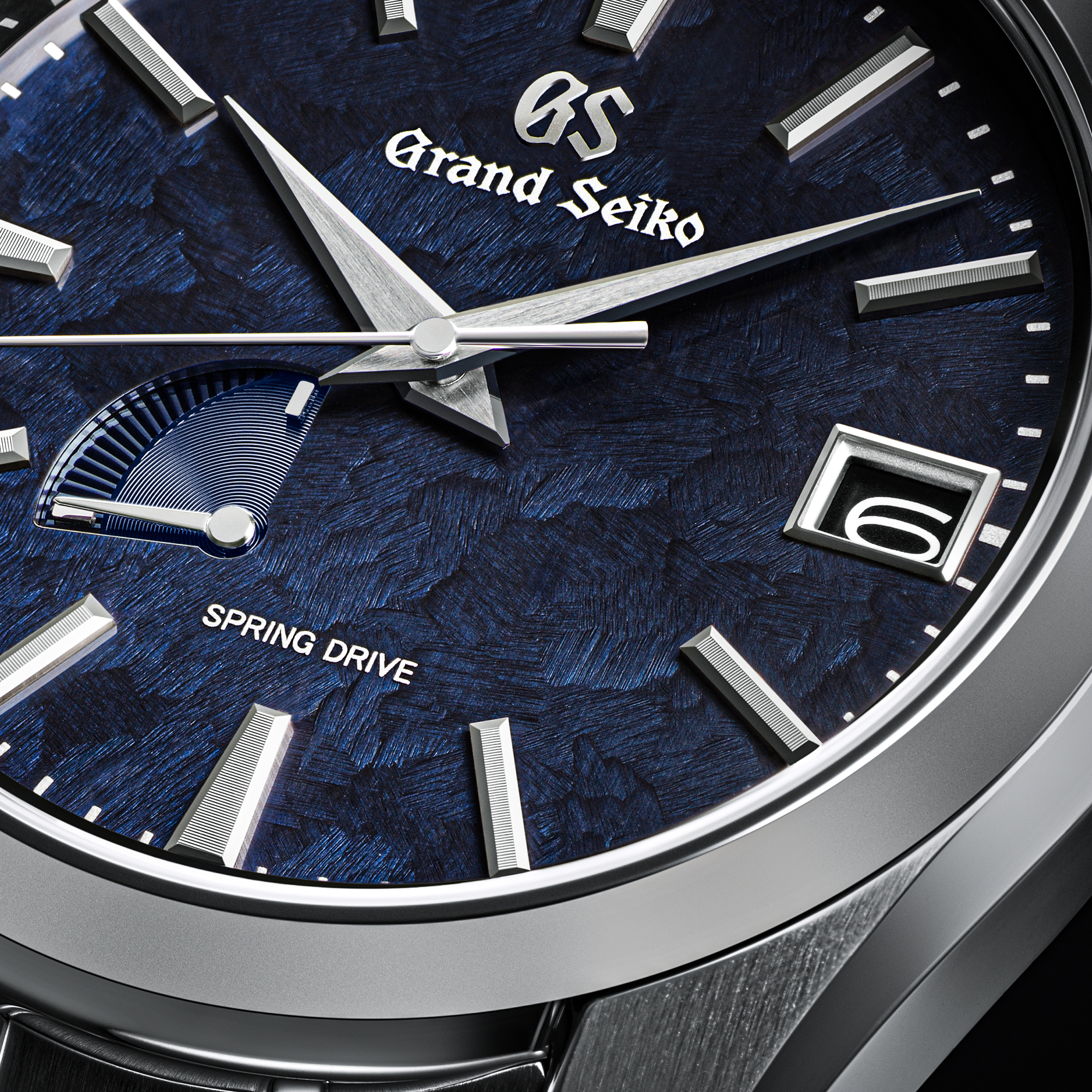
leaving the period off "Co."
cannot unsee. actually looks a bit "knock off" like that
-
• #59584
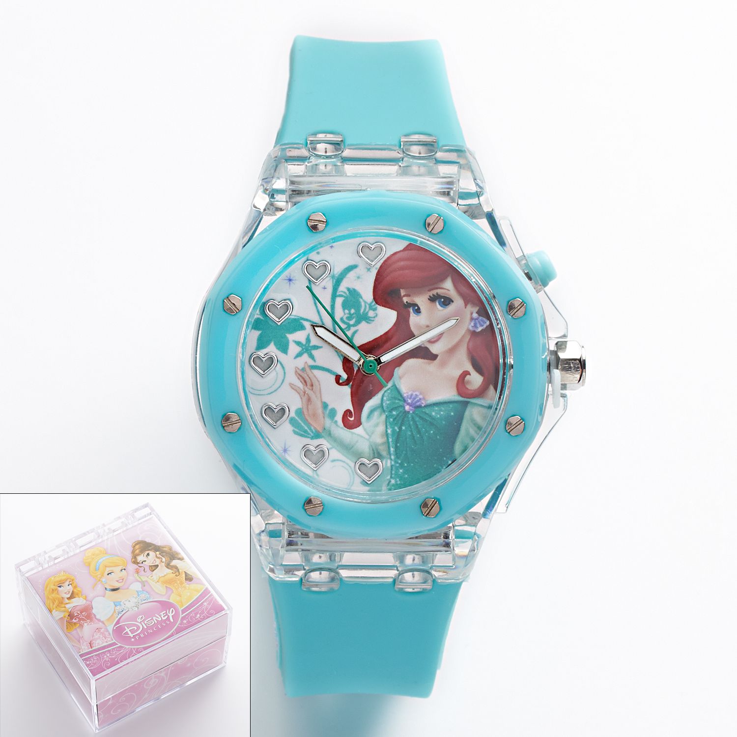
Except when he talks Ariel cause he starts sounding a bit crazy... (jokes buddy!)
-
• #59587
And hate yourself for ever liking it
-
• #59589
The thing which I can't unsee is the centering of the logo, vs text
-
• #59590
That why I got the Paulin watches, I don’t wanna see his wrath with a letterpress.
-
• #59591
I keep on idly thinking I should c&p his posts into the Hoodinky comments to see if Ben Whatshischops deletes them.
-
• #59592
Mate, you better believe I’m over there calling them out when they put Arial on the tachy scale of their $30,000 HOODWINKEE x Montblanc collab.
They brought it on themselves - SJP did an interview with Jonathan Hoefler and got all preachy about typography so as far as I’m concerned they’re fair game.
-
• #59593
What's the take from other posters and do the comments survive?
I remember posting a derisory comment ( but far from offensive or inappropriate) and it was removed.
-
• #59594
Soon to be nicknamed “Ariel Oak” by the community.
-
• #59595
Generally they get 2 likes and are widely ignored.
-
• #59597
U talking bout Seiko yeh? 😁
-
• #59599
That's norty.
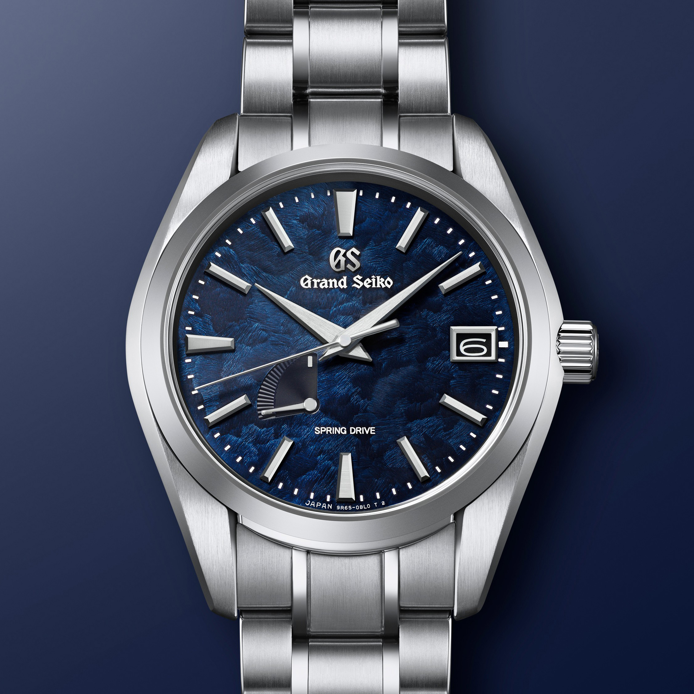
Still can't believe that 'grandseikogs9club.uk' is a genuine GS domain ha
-
• #59600
Ha. I like to think it's an internal GS splinter group subverting the Seiko patriarchy by posting actual decent photographs of the watches.
 AlexD
AlexD umop3pisdn
 Regal
Regal D-Dog
D-Dog swedeee
 PawG
PawG ChainBreaker
 smithchild
 rj
rj edscoble
 hugo7
hugo7 Ordinata

 JB
JB @coppiThat
I'm not even going to mention the way they've squeezed "LVMH" in there. I'm embarrassed for them.