-
• #19302
I love the PRS-50b. How did you find it?
-
• #19303
Helson is absolutely ace. Love the mesh too.
-
• #19304
What's the model by the way?
-
• #19305
I loved the 50B. Like most of Eddie's stuff it's ridiculously well built for the money.
-
• #19306
The new sub homages from Eddie Platts are supposed to be superb.
-
• #19307
I very nearly pulled the trigger on one of those last week, I bought a bass guitar instead...
-
• #19308
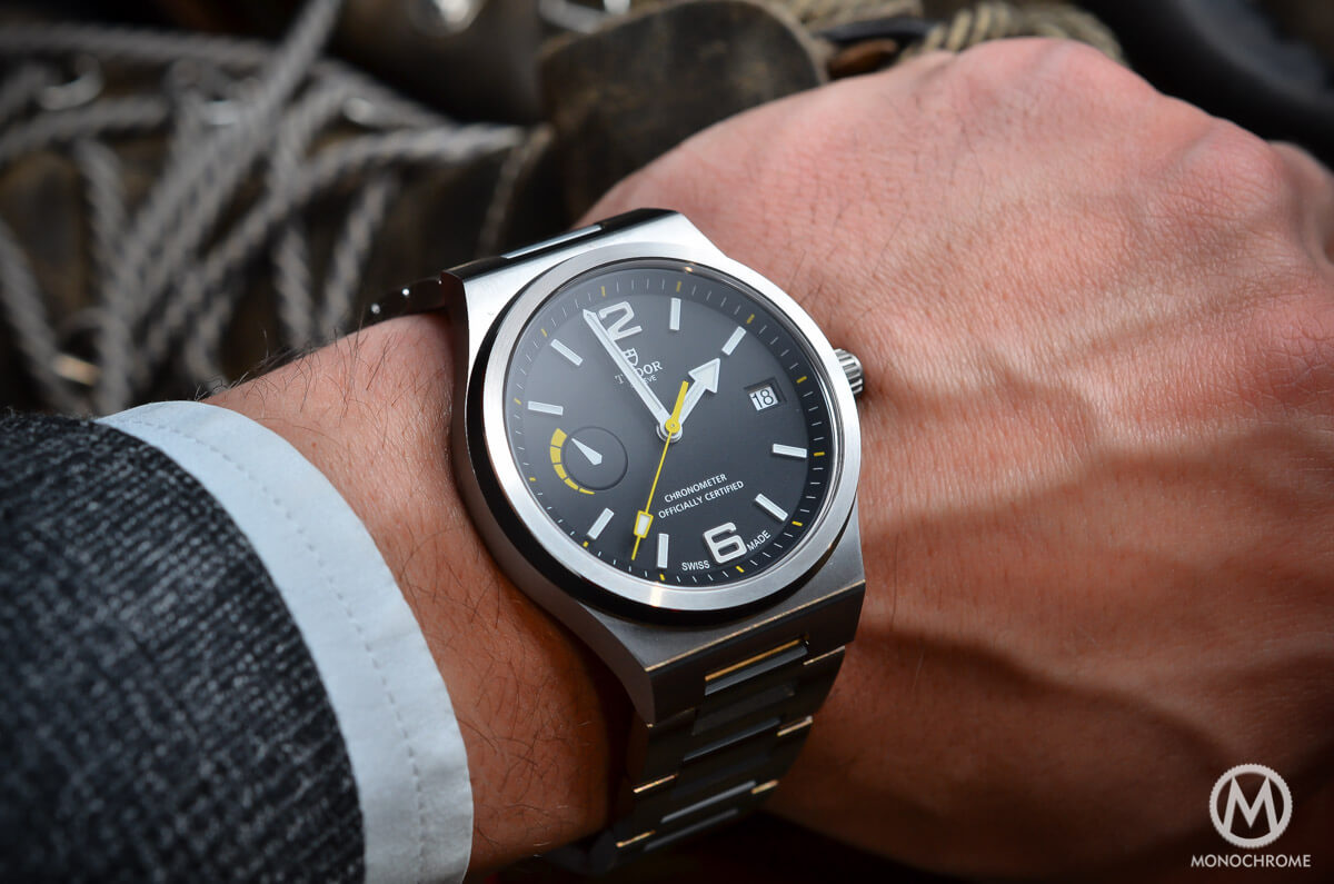
Giving serious thinks to trading in my North Flag:

For a 1st gen (ETA) Black Bay Black:

The North Flag is beautifully made, but with the sheer faces and sharp edges it's a little clinical, and I've not really bonded with it (yet? It's been 9 months). The BBB has been an itch that needs scratched since I saw the one-off Black Bay One that it's based on. Talk me in/out of it.
-
• #19309
Have both = problem solved.
Personally I prefer the North Flag.
-
• #19310
That north flag is taste.
I'll give you twenny dorrar -
• #19311
Can't do both. But ditching the NF leaves room for an Explorer next year, which is what I really wanted in the first place, if I'm completely honest.
-
• #19312
Do it.
-
• #19313
The Explorer is the one.
I agree re: the north flag. It's too clean, too clinical.
-
• #19314
That's what I like about the North Flag!
-
• #19315
It's what I initially liked about it in the press shots. Having tried one on, it just looks like a toy watch. There's no depth to it.
-
• #19316
NF is cool but the Black Bay is a real classic. Would wear. Remind me what's so spesh about the mk1.... and where will you get one?
-
• #19317
Explorer 1 is THE classic for me. Lot's of love for several of the recent Tudors, but if there had to be only one......
-
• #19318
.
1 Attachment
-
• #19319
Stahp!
-
• #19320
The ETA model was only made for about 6 months. It has the old 'rose' logo instead of the modern shield logo on the mk.2, which is a bit less in keeping with its vintage look. The curved 'rotary self-winding' text, vs the straight lines of text on the mk.2. Standard oyster-ish bracelet vs the riveted bracelet on the new one, which I suppose is more vintage-correct, but looks a little contrived to me with the modern solid end-links. Several hundred quid cheaper. There's one sitting in the window of the local Rolex/Tudor dealership.
-
• #19321
Do it... I couldn't get past the gold on the dial when I tried one on... Still a lovely man bracelet tho'...
-
• #19322
The screw next to the clasp on my steinhart bracelet keeps coming loose. I screw it back in but a few days later it's worked it's way out again. thoughts?
-
• #19323
Thread lock.
-
• #19324
Touch of oil?
-
• #19325
That's a tad extreme no?
 Stonehedge
 DrJimmyMac
 rodan
rodan handtightenonly
 DethBeard
 Ordinata
 Soul
Soul Olly398
 The.Gren
 Tenderloin
 ChainBreaker
 @coppiThat
I had to scratch that itch a few years back too. I tried a PRS-50B.