-
• #702
35 to 53
-
• #703
77 to 11.


15 to 1.


35 to 53


15 bottom fading to 10 top.


16 to 8


-
• #704
ooo i like 77-11 and 16-8, 10-15 is nice too but i feel it would suite something more classic and streamlined
-
• #705
Oh dear...
...clearly Superprecise and Spotter are the only ones trying to be helpful. The rest are clearly trollin'.
-
• #706
I was thinking that too, maybe 77-53.


hugo, I like to see some extraordinary combination of colour, go wild, it's a Brooklyn, not a Langster.
-
• #707
^too bob jackson'y
-
• #708
hhhmmmm... both nice colours and they go together, but I'm not sure they'd work as a fade.
-
• #709
to be honest I'm feelin' 15-1.

-
• #710
Oh dear...
...clearly Superprecise and Spotter are the only ones trying to be helpful. The rest are clearly trollin'.
I wasn't trolling
-
• #711
what about 19-55?
-
• #712
18-35 perhaps?


-
• #713
reminds me too much of this

-
• #714
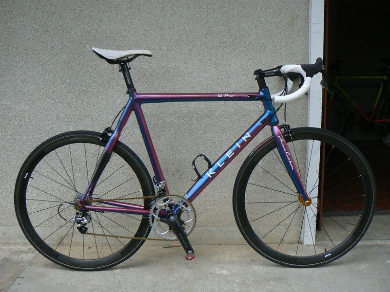
Actually, I should've though about going the Klein approach;


http://static.lfgss.com/attachments/30036d1282774666-p1010094.jpg
-
• #715
top klein is lush
-
• #716
Oh dear...
...clearly Superprecise and Spotter are the only ones trying to be helpful. The rest are clearly trollin'.
Nah, I was actually referencing the now defunct but long-running quiz programme. You know, for a laugh.
I reckon fades from one gaudy colour to another look a bit wank. If the colours are too different you end up with a hideous middle colour. If you fade from, say, yellow to orange, as per Skully's excellent Waugh, then you get a nice smooth blend. Basically, work around the edge of the colour wheel instead of jumping across it.
Personally, my fave fades are those that go between a bold colour and a neutral. I saw a killer frame the other week that went from mint green to white to grass green. Looked awesome.
-
• #717
ed the bike is looking loads better.
-
• #718
beige to tan
-
• #719
ed the bike is looking loads better.
to the point I kind of want one. It really has shifted from hate to love nice work
-
• #720
it was the rack...
-
• #721
Oh dear...
...clearly Superprecise and Spotter are the only ones trying to be helpful. The rest are clearly trollin'.
I was serious. The green could be a tad more pale. But I thought these looked nice. Neither too overpowering.
I have pretty bad asthetic judgement though, if I'm honest.


-
• #722
... Basically, work around the edge of the colour wheel instead of jumping across it.
...I am inclined to agree. There's that lovely NJS Panasonic(?) from track supermarket which had a sliver and charcole fade.
-
• #723


Better?
-
• #724
beige to tan
rep'd
-
• #725

 spotter
 edscoble
 hugo7
hugo7 rik
rik StandardPractice
 Balki
Balki Smallfurry
 F34Rthefixed
 @runcible_rakan
15 to 1.