-
• #18902

-
• #18903
Very nice. What annoys me is the data visualisation fail. Those circles are extremely inaccurate! If they didn't want the infographic to look weird by a having barely visible 0.7% circle they should have just used a different visual method to compare the figures, because it not only mis-represents the data, but makes the difference less pronounced than it actually is because the smaller circles should be much much smaller!
-
• #18904
A circle with area 41 has a diameter of 7(ish), a circle with area 3 has a diameter 2(ish) so the bigger one should be 3.5 times wider.
-
• #18905
yep, spatial awareness fail there scoot. Anything else would have been misrepresentative.
-
• #18906
27 vs 0.7
one is about 38.5 times bigger than the other, which I can see from the infographic
-
• #18907
were you maybe thinking that the blue circle was supposed to represent 0.7% of the red circle?
-
• #18908
To elaborate
The first one, 41% vs 3%. If you scale that up to make it more easy to see what they are trying to represent you could make the larger circle 100%, the total of what the public are assuming. In that case, the smaller circle would be just over 7 (3 x 2.44, seeing as 100/41 = 2.44). Therefore, the red circle should be just over 14 times larger (in area) than the blue one, which looks fine above.
The second one, 27 vs 0.7, we have already covered, but for clarity, would be 100 vs 2.6, ergo 38.5ish times bigger.
The third one, 48 vs 27.8 would be 100 vs 57.9 : 1.7 times bigger.
Still all seems cushdy to me.
The third one
-
• #18909
not to labour a point or anything...
#antidesignerrage
-
• #18910
The radii of the 27% and 0.7% circles are 21.1px and 4px respectively
The larger one is therefore roughly x28 the size of the smaller. It should be x38.57 however this would only require the radius of the smaller circle to be 0.6 px smaller, so the difference is most likely due to measurement error, and the graphic is correct.
Area of a circle is proportional to the radius squared. For a circle to be x38.5 larger, it would only need to be x6.2 wider.
-
• #18911
What size of a circle should be used for humble pie?
-
• #18912
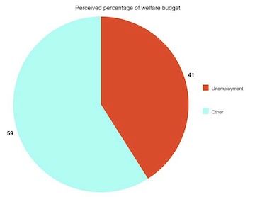
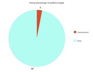
A pie chart would have made if easier to illustrate the points perhaps?
*#prodesignimprovementsuggesttrage *
-
• #18913
I'm confused, because I see the two circles as being arbitrary shapes used to represent percentages, which should be directly relative to the size of the hypothetical 100%
So say this 100x100mm circle represents 100% of the welfare budget:
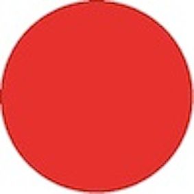
This circle is 41x41mm: so is 41% of the size of the entire welfare budget, and the percentage that people perceive goes to unemployment benefits:

And this is 3x3mm: 3% the size of the 100% welfare budget, which is the actual amount spent on unemployment benefits

I agree with skydancer that two pie charts have been much more effective. Or even a bar chart.
-
• #18914
See, look how much clearer this is!
-
• #18915
I'm confused, because I see the two circles as being arbitrary shapes used to represent percentages, which should be directly relative to the size of the hypothetical 100%
So say this 100x100mm circle represents 100% of the welfare budget:

This circle is 41x41mm: so is 41% of the size of the entire welfare budget, and the percentage that people perceive goes to unemployment benefits:

And this is 3x3mm: 3% the size of the 100% welfare budget, which is the actual amount spent on unemployment benefits

I agree with skydancer that two pie charts have been much more effective. Or even a bar chart.
You are mixing up your dimensions, the most important thing is the area of these circles, not the diameter (which is also not described as A x B : that is for squares or rectangles). If you double the diameter of a circle you more than double it's area.
-
• #18916
See, look how much clearer this is!


Pie charts are unnecessary here and take up more space than the infographic needs. You leave people wondering what the "other" is.
-
• #18917
I'm confused, because I see the two circles as being arbitrary shapes used to represent percentages, which should be directly relative to the size of the hypothetical 100%
So say this 100x100mm circle represents 100% of the welfare budget: Area of this circle is 7,850mm squared

This circle is 41x41mm: so is 41% of the size of the entire welfare budget, and the percentage that people perceive goes to unemployment benefits: WRONG a 41mm diameter circle is 1,319.6mm squared, so 16.8% of the size of the 100mm diameter circle.

And this is 3x3mm: 3% the size of the 100% welfare budget, which is the actual amount spent on unemployment benefits: WRONG a 3mm diameter circle is 7.065mm squared, so 0.1% of the size of the 100mm diameter circle

I agree with skydancer that two pie charts have been much more effective. Or even a bar chart.
.
-
• #18918
^^^but surely seeing as its harder to perceive the area of a circle it would have been better for the purposes of an infographic to use a shape that is more easily understandable, after all the point of infographics is to display complex data in a way easy for viewers to understand.
-
• #18919
^^^but surely seeing as its harder to perceive the area of a circle it would have been better for the purposes of an infographic to use a shape that is more easily understandable, after all the point of infographics is to display complex data in a way easy for viewers to understand.
Seeing as shapes were one of the first things I learnt as a nipper, I wouldn't have said it was hard to perceive the *relative** area of a circle in the first place.
*it's only necessary to understand the size relative to the next circle
-
• #18920
What's so hard to understand about the difference between 3% and 41%?
Just possibly an info-graphic is not really needed at all in this case in what is supposed to be a serious paper for intelligent adults? -
• #18921
What's so hard to understand about the difference between 3% and 41%?
Just possibly an info-graphic is not really needed at all in this case in what is supposed to be a serious paper for intelligent adults?I reckon more readers of this forum would have understood more easily were the details displayed as triangles......
-
• #18922
Though the graphics did help me get my head round the difficult concept of a couple with two school-age children.
-
• #18923
Seeing as shapes were one of the first things I learnt as a nipper, I wouldn't have said it was hard to perceive the *relative** area of a circle in the first place.
*it's only necessary to understand the size relative to the next circle
Yes, but the point is its hard relative to other methods of displaying the data. If the point of designing an infographic is to make information easy for users to understand and visually pleasing, then using the relative area of circles may not be the best method because its not the easiest to understand. Lets not forget not everyone has the same ability to perceive the relative area of circles, whereas using something like a series of repeated square units would be much easier to understand for everyone, making the infographic a more powerful tool.
-
• #18925
Yes, but the point is its hard relative to other methods of displaying the data. If the point of designing an infographic is to make information easy for users to understand and visually pleasing, then using the relative area of circles may not be the best method because its not the easiest to understand. Lets not forget not everyone has the same ability to perceive the relative area of circles, whereas using something like a series of repeated square units would be much easier to understand for everyone, making the infographic a more powerful tool.
Obviously, there are a myriad of ways (judging by a quick google search) to skin this particular moggy. The point is that using these circles is not a misleading way of representing the data, or that they were incorrect, as originally claimed.
 Prole.
 Scoot
Scoot eone
eone stevo_com
 neu
neu skydancer
 fade
fade @Platini
Jesus did this to you.