-
• #27
-
• #28
Plus Betty's design has a good idea behind it. Kinda reflects the freedom you have when cycling round london (to me anyway)
Like the TFL campaign?
I have the .eps of the logo should anyone want it.
-
• #29
The one where the bikes are made from scrawly type? Yeah, true...
Also the skyline is being used by Schwalbe on their "london" tyre adsGuess it shows how much our subconscious absorbs things and spits them out as ideas.
-
• #30
not really. the london skyline is hardly a schwalbe first
-
• #31
I think there's still an old LFGSS header on the server... let me look for it:

-
• #32
I really should tidy the servers up.
-
• #33
Betty's black one is very good. These will be a cycling jersey cut, with pockets on the back, not just plain Ts, right? Would it be good to have a template based on the Ts that will actually be used?
-
• #34
I think they are T-Shirts, rather than jerseys.
Betty's one is nice, needs a tweak so it doesn't look like it says 'eggss' ...
-
• #35
buggered if I can get this to load as anything other than thumbnails
however...
This, in reflecto should be the back of any future jersey.
-
• #36
2p:
I like Tenderloins design, cool and looks 'Commercial' to me.
I also like Lowpug's strap line of 'The real transport for London'. -
• #37
Tenderloin, Betty and Apollo designs are ace. Would buy them all.
-
• #38
^ I think Tenderloin just embedded horsee1's design,
and thanks!
-
• #40
^ I think Tenderloin just embedded horsee1's design,
Yes, I was being a good egg.
-
• #41
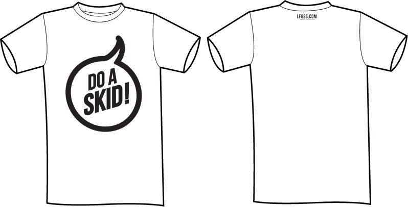
Just a very quick and simple idea that highlights one of the forums more positive sayings.

That's great!
Anyone got the Pulp Fiction, "Are you Spokkin' to me."
-
• #42

-
• #43
Hi everyone,
I'm a long time lurker (creepy) and quiet gleaner of bicycle related information, so I figured it would be nice to actually contribute something to the forum... And I've been wanting to draw some cycling caps for a while so perfect excuse.
I like the stack one most but I've mocked up some other configurations- if anyone thinks of a way it could work better I'm more than happy to tweak it. Oh and I've stuck in a higher res version of one of them so you can see the style of the drawing a bit better.
Anyways, hope you like 'em. Oh, and apologies if I've attached the images in a cretinous manner and they're huge or something.
Cheers, Si
3 Attachments
-
• #44
^First one I'd actually wear
-
• #45
Too nice. Next!
-
• #46
Yes! Would buy! I like the 'chapeau' ones the best but the stacked one is also awesome.
Can we get the caps made as actual caps too? They're fucking cool.
-
• #47
Here are youch's designs embedded for lazy people who can't be bothered clicking thumbnails


-
• #48
definitely the best one so far. they only think i would change is the chapeau font.
-
• #49
Agreed. 1 down 2 to go?
-
• #50
Pretty H&M
 roboto
 Velocio
 TRA
TRA ObiWomKenobi
 William.
 LongAndWinding
 lardboy
 jogger
 pootsmanuva
 Tenderloin
 *Matt*
 bq
bq


 Mickie_Cricket
 EEI
EEI Scoot
Scoot laner
laner hbmagpies
Does anyone need the LFGSS logo as a vector? I could be wrong but I have created one based on the font Gotham Bold. If anyone wants I can upload the files somewhere.