-
• #54927
Vario, single pass stretchy nato which is pretty nice, the buckle is much better than competitor.
1 Attachment
-
• #54928
Personal pet hate. Why can’t everyone do this instead! Numerals more important than subdials
-
• #54929
What a Seiko wave today..
I will have a SLA017, or SLA037 at some point, both awesome ! Any short review @inchpincher @Regal ?
-
• #54930
I’m not 100% sure what the rationale is but I guess it’s probably prioritising legibility of the subdial dial over the number. I get why you would leave a partial numeral rather than remove it entirely though.
-
• #54931
Love this. Summers coming!
-
• #54932
Really digging the Benrus Type 1 reissue recently, I think it would be a nice dayli/beater..
1 Attachment
-
• #54933
I love my SLA017… it has its minor foibles, one being the blobby lume that you can see in some pictures (usually only really noticeable in bright light when it casts a shadow). The rubber strap is great but the bracelet the 017 also comes with is an insult, they shouldn’t have bothered.
There is also the big criticism that came from Seiko enthusiasts when it was first shown, that they chose not to use applied hour markers (as per the original 62MAS). Instead they have used a version of the technique they use on all their divers watches right down to the Seiko 5: namely, stamping the markers from the rear of the dial and then machining/polishing them flat. You end up with softer corners to the markers and you can see where the dial curves up to the marker as a result of the stamping process.
Having said that, they are machined and polished extremely nicely on the SLAs, it is a different level of finishing to the Prospex / MM models and the effect is very different. It clearly looks like a more expensive watch with much greater attention to detail.
So a great case, great bezel, nice domed crystal, very nice hands, nice sunburst dial and the overall effect is that it works unbelievably well. It really hangs together. Perfect size at 40mm too.
Main criticism is the price I suppose. Despite using undecorated GS movements they still don’t properly adjust them, which is a real dick move, frankly. Mine is very accurate but I know I got lucky.
For me it actually is an exit diver, I’m not looking to get drawn into vintage so there’s nothing else I’d rather own. Does it compare poorly to a modern Rolex Sub, objectively? Yep. Does it have the quality of design and overall vibe for me to prefer it to a Sub? Definitely.
-
• #54934
Yeah I think that one is really nicely done. Very austere but in a good way!
-
• #54935
I’ve tried the SLA037 in a Seiko shop once, overall dimension are excellente
I guess it’s very similair to the 017 except from movement and dial color..
Doomed crystal, bezel and bezel click were on point. About the dial, suburst is gorgeous, but coming from Rolex, hour makers suffers from a lack of relief, stamping could have been deeper IMO..
I’ve passed on the blue as the 017 was the fist target, pricing point was another reason
2 Attachments
-
• #54936
Having compared @inchpincher’s 033 to my 017 in person, it was quite interesting. The steel is slightly brighter, the bezel insert has more contrast and the dial printing is whiter. It’s like an HDR version of the 017. Basically the same watch (on the outside), but with the contrast turned up a fraction.
1 Attachment
-
• #54938
Fun police here…
… no objections, carry on.
-
• #54939
Fun police!
-
• #54940
It’s funny because in French police can mean font in the right context :)
-
• #54941
the right context :)
That's what the fun police are looking for
-
• #54942
I'm getting more into watches lately and like watching this girls video's, but this one gave me a strange feeling.... This level of excitement over some expensive material possession feels awkward to me, how do you guys feel about this?
https://youtu.be/pA29Ma6a_a4
-
• #54943
I just don’t watch channel that refuse to put close captioning in their content.
-
• #54944
Missed Friday 😪
1 Attachment
-
• #54945
Just a quick question
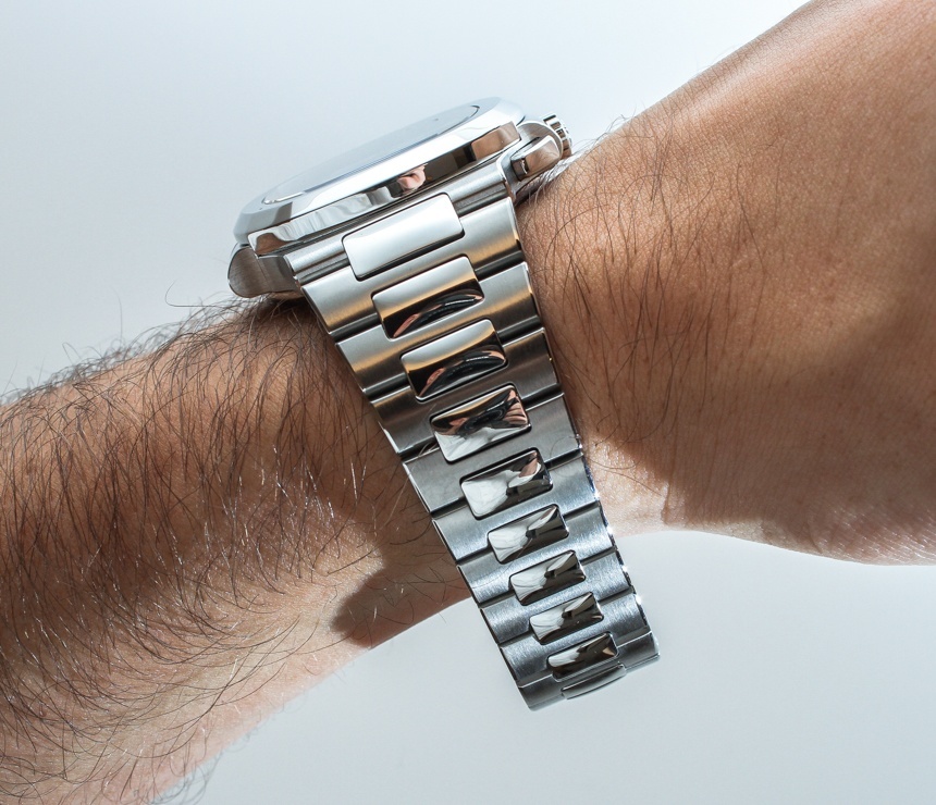
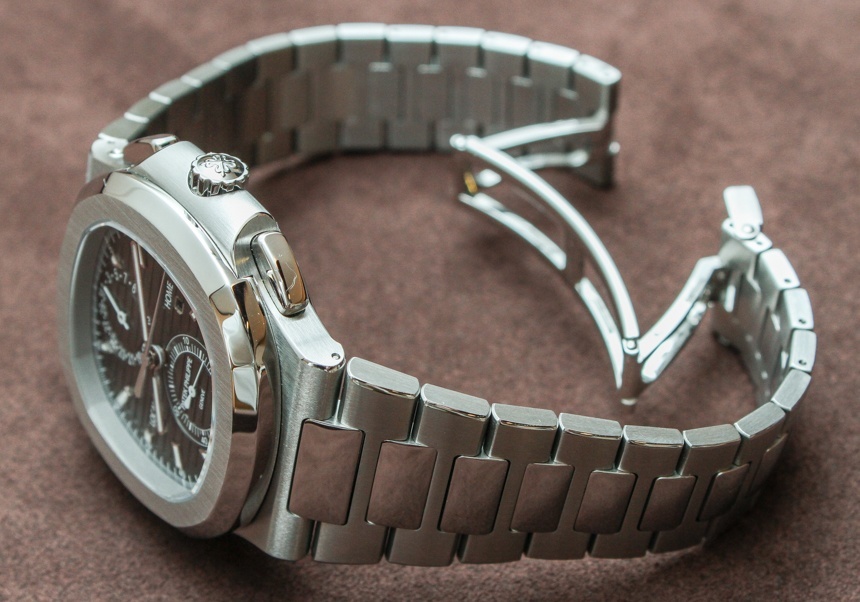
How does one adjust a bracelet with a taper? Surely if you remove links, it will look odd? Even if you remove them at the clasp, surely the clasp width won't match the bracelet width because of the missing links?
Look at the photos, some links should be removed but then it'll not match the clasp.


Am I missing something?
-
• #54946
Am I missing something?
Yup.
The removable parts of the bracelet is non-tapered.
The only way you need to removed even more link is for wearing it on your thumb.
-
• #54947
It’s what she’s into , it’s a thoughtful present why wouldn’t she be delighted ?
It doesn’t bother me .
But she is bothered by an open door ... -
• #54948
Yup
To the point
Lol
-
• #54949
Oh that is perfect.
Apart from the size, don't think it would work on my wrist. -
• #54950
personally I try and look as disappointed as possible when people get me something I like, keeps them on their toes
 edscoble
 magpie
 hacha
hacha Regal
Regal goodhead


 smithchild
 PawG
PawG cgg
cgg ChainBreaker
 kjlem
kjlem Tenderloin
 c.h.e.
 @coppiThat
Nice one, captain.