-
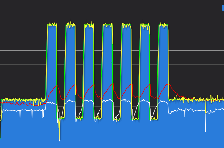
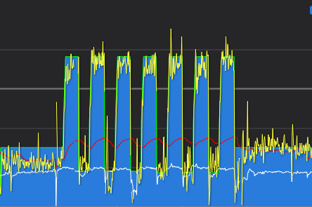
There's no way that second graph is an accurate representation of power values.
Is it because it's recording the load setting on the trainer rather than actual rider power? Even with long arse averaging enabled it seems far too rigid to me.Even if it's taken from trainer only, it's still implausible...
Power Graphed with only Smart Trainer:

Power Graphed with PowerMatch (Smart Trainer + Power Meter):

You are reading a single comment by @J0nathan and its replies.
Click here to read the full conversation.
 Hovis
Hovis hippy
hippy @J0nathan
What would cause these two graphs to be so different? The first is from a session I did last night (using the Elite Diret0), the other is from someone random I follow on Strava (device unknown).
i.e. why does the power track so smoothly on the second one? Is this related to the ~2.5% accuracy of the Direto perhaps?
2 Attachments