-
• #127
Cool beans, i would have hated to see the article headline "Cyclist killed due to vandalism" as it seems to be any excuse and the driver get off light
http://www.bbc.co.uk/news/uk-england-london-19858746
BTP said graffiti was "unwanted vandalism that causes criminal damage" and "will not be tolerated".
No damage, no law-breaking.
Even the most steroid-fueled nutcase driver is gonna have a hard time catching or killing a sticker bomber, especially when it's at the back of a vehicle.
-
• #128
^^you're a monster.
will have a wander at lunch, see if I can find anything with one on parked up. -
• #129
Needs 'deal with it' sunglasses...
-
• #130
Need help, I do a lot of posters and stuff extra curricular to my work for charity fundraising events, But I suck at making posters! Any one with good tips for pro looking posters could you let me know?!
-
• #131
Keep it simple.
-
• #132
http://lmgtfy.com/?q=graphic+design+course
Not meaning to sound disparaging but there isn't a
this one amazing tip will change the way you design posters forever and you won't even guess what it is
answer to that. What works in one context will look awful in another context. Best advice is to go to a library, and look at some design books. You don't necessarily need to read much, just have a look and decided for yourself what works and what doesn't
-
• #133
Plagiarism is your friend...
-
• #134
I just wondered it there was a best practice, thanks for the advice ill keep doing what I'm doing of googling similar events finding posters i like the look of and copying the design then.
I'm not very arty so I get that a few of you will cringe at what i said but it gets the job done and its all for charity. -
• #135
Use really cool fonts, the more the better. Also - try to use in as many sizes and colours as possible - this will really help your design 'pop'.
If the poster has logos, make them as big as possible, these are what people want to see - not information about whatever you are advertising.
-
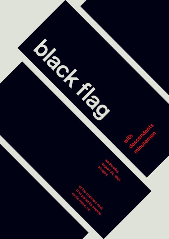
• #136
Just do something like this...

-
• #137
he he he...
not bitter at all Dan? -
• #138
Hey guys, doing a little bit of graphic design for the flyers/poster for our society's Edinburgh fringe show. It's my first attempt and could do with some advice/pointers. If anyone has any suggestions or advice that'd be amazing.
2 Attachments
-
• #139
I'd move the horizontal lines on the back further apart, feel a little close to the text within, other than that, good, I like you, you can have all the money but I want 25% of the equity
-
• #142
http://seanalexanderfisher.tumblr.com/post/137570055098/logo-variations
Comments on this as a logo for my designs?
-
• #144
I like it. Is it your own company logo?
-
• #145
Yeah :)
-
• #146
Definitely have the same line weight throughout. Top row, second from the right is my favourite but the F feels odd. Top right is second fave.
-
• #147
Go full lozenge and white out of black, more wax seal like... TBH I think it still needs a bit more work, gonna be good once it's done tho'...
-
• #148
Bottom middle is best for me so far, it's the most balanced. TBH I think it needs to feel a bit more delicate, it all feels quite heavy and brutal at the moment - that may be what you're after though.
^this is a good suggestion
-
• #149
Bottom-middle for me, looks the most refined, like a nice technical illustration of something camera-y
-
• #150
Thanks for all the suggestions, industrial/brutalist is what i'm trying to go for. I'm paring it up with the univers font.
 hippy
hippy 6pt
6pt Mule
Mule  TRA
TRA branwen
 dan
dan WilliamJohn

 Crispin_Glover
 fizzy.bleach
 amey
amey seafish
 Ordinata
 Sumo
Sumo Trunkie
Plus I was using Gill not Johnston.