-
• #3277
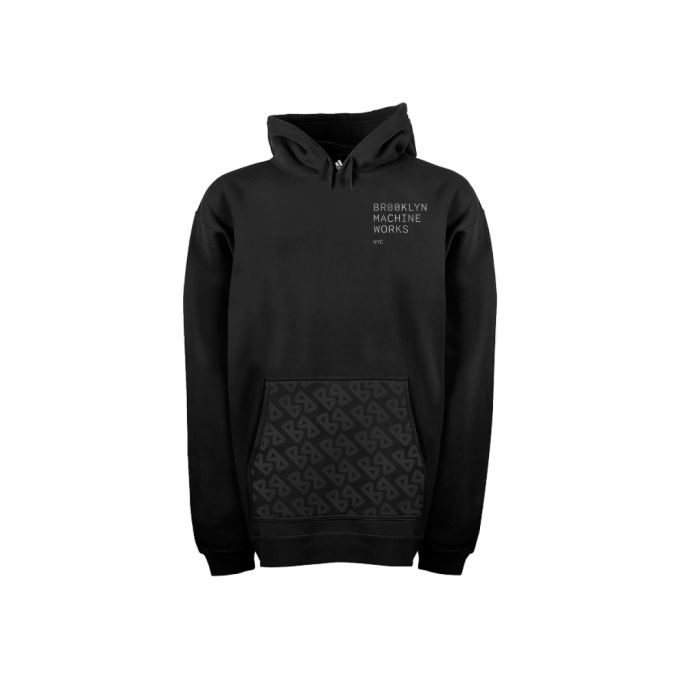
The jumper looks good, but I'm not so into the new colour thing.
A bit less iconic than having the big Brooklyn logo down the side.
That said it doesn't look bad... Just a bit dull
-
• #3278
Now that I know it isn't someone personal bike that new re brand looks terrible and its only complex. Dear sweet jesus...
-
• #3279
yeah fuck that shit.
looks shite. -
• #3280
agreed. looks crap. old logo was iconic
-
• #3281
I've mailed bmw what shipping costs to the Netherlands would be, it would be around 125 dollars they replied. I could transfer the total amount through PayPal and they would ship the gangsta v3 to me. Adding the custom fees i would pay in total around €1700 for a gangsta v3. Time to start looking elsewhere..
-
• #3282
I MUST say this: Burger King Machine Works
Old logo and overall old name must be preserved. It was BMW, now BKMW? :(
New color scheme looks fine anyways. -
• #3283
probably they realized by now that theres a car manufacturer called bmw
-
• #3284
the logo on the hoody looks like the new richard sachs logo
-
• #3285
Get a copy from an European framebuilder?
-
• #3286
I hope thats like a one off, If they do that its game over! Change from a cool OG branding to shite generic new stuff.
-
• #3287
+1
-
• #3288
I fully agree with comments about the new branding..it doesn't work for me at all.
But something you all seem to be missing is that Brooklyn Machine Works existed long before the Gangsta track frame was released....and this isn't the first time the branding, logo, typeface etc has changed.
When they changed from their previous 'iconic' logo to the logo you're all referring to as their 'iconic' logo, there was lots of moaning then too...but we all accepted that BMW is about bikes first and foremost.
If a change in logo/branding/colourscheme etc is going to change people's minds about wanting to own one, then you were never really getting why BMW started in the first place, and what they've set out to achieve throughout their long, and at times difficult journey.
A good design is a good design, no matter what colours or logos you wrap it in.
Just my tuppence worth as a LONG time BMW owner, having owned six Brooklyns over the last 16 or so years, and seen the company change and grow more than once. -
• #3289
2manyfontz
1 Attachment
-
• #3290
LOL at that advert at the top^
-
• #3291
How are you seeing ads like that on Instagram?!
-
• #3292
windows phone using 3rd party app?
-
• #3294
They Talbot forks are £200 for anyone thats keen gonna grab myself a pair for my birthday!
-
• #3295
Really, never knew that. Cheers!
-
• #3297
If a change in logo/branding/colourscheme etc is going to change people's minds about wanting to own one
after riding a v2 track for some years I could say that the best part is the logo
-
• #3298
-
• #3299
Weirdly accurate
-
• #3300
and how many of those 6 brooklyns had logos other than the one we love so much??? I have known people with brooklyns for around 10 years. every single one with the classic logo
edit: a friend of mine who used to ride for brooklyn had these on his MCL

which I would kill for another set of (he had a spare set but lost them!!)
 timbre
 konastab01
 BlesUp
 swedeee
 Föhn
Föhn Dr.E
Dr.E negaatio
 Eingang
 Heldring
 bankiren
 Antidotes
 Tenderloin
 B0N0R
B0N0R Dom
Dom faffe
faffe
 @runcible_rakan
oH, no. I guess they are changing their logo and stuff... this gangsta looks good!
this seems nicer than the uniqlo shit
