-
• #3
some nice photos tho!
-
• #4
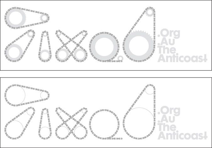
i dont think that is quite fair, they used a cog as an o, its not logo science
-
• #5
A cog as a logo?! That'll never work!
-
• #6
Shabby logo as well.
...The mag one.
-
• #7
good point JOL!
;)
-
• #8
I think it is highly unusual and takes a lot of extreme creative brilliance to employ a cog as part of a logo when dealing with bikes - I am surprised to see two examples !
Perhaps we are on the cusp on a new intellectual and creative renaissance ?
-
• #9
What do you mean....

;)
-
• #10
Trust the Aussies to take it too far..
-
• #11
what do you mean?? Using a cog as a letter!!?
The result of a workshop I did in 5 days with swiss design students about a year ago
check the main font...
-
• #12
yorgo, thats one sweet magazine you made, very nice indeed, are there any other issues?
-
• #13
I actually did not do it - the students did it under my "supervision" kindof. They were really good. I just chose fixed gear as a random subject, none of them knew anything about it and that's what I thought would make it interesting.
-
• #14
That's a very cool magazine, le car. Fierce stylish.
-
• #15
le car, i normally skip read these type of mags. but that one was really interesting. possibly because they knew nothing about it? no pre-conceptions?
anyway, an interesting read and bloody good going for 5 days.
-
• #16
Elvis le car, i normally skip read these type of mags. but that one was really interesting. possibly because they knew nothing about it? no pre-conceptions?
I think the correct term would be pre-cognitions.
!!!
I will be signing autographs in the lobby.
-
• #17
:) very witty
 flickwg
 hippy
hippy JOL
JOL tynan
tynan le_car
 Nicholas
 Elvis
Elvis
At here...