-
• #152
All colnago masters are ugly. most fades are ugly. xx
Overall fair point - there are some hidious paint jobs so far. But not all masters are gash, and it is possible to have something so hideously decorative that it becomes good. I think Somecs are better than 'nagos on paint for that. Nice blend of creativity while still being balanced (if that makes sense).
Also totally take issue with your fades point - the Co-Motion, skullys bike and the green and white Columbus Max are all awesome. Fact.
Also just to gauge your taste I'd be currious to see what youre into
-
• #154
I always wanted a somec by the way.
-
• #155
armourtex, they'll powder coat is which will be much tough for your next 9k.
Real talk now; How should I get my new bike painted?
This is it:

I was thinking a top too bottom fade using the same colours as jose

i.e. blue at the top fading to purple, thoughts?
-
• #156
Purple on top and blue on the bottom.
Having the darker colour on the bottom gives an impression of weight and sluggishness.
The other way around looks meaner and faster.
-
• #157
With those bars I think a front to back fade going mainly from the headtube rolling around over and passing along the top tube. Light to dark.
-
• #158

-
• #159

-
• #160

-
• #161

-
• #162
Just repped William only to float into love with most of those Somecs. If you do it right fades and cut ins can look so sweet. Spot on about a lot of Masters though (with the exception of the cycling man graphic), I've often thought that the combo on certain Nagos of toxic yellows and pinks with a fair bit of chrome makes the chrome look like plastic. They look a bit 'lighter' than they actually should. As if the very material of the frame has been altered.
-
• #163
Gotta love Somecs.
Their logos always make me think of 8-bit video games. -
• #164
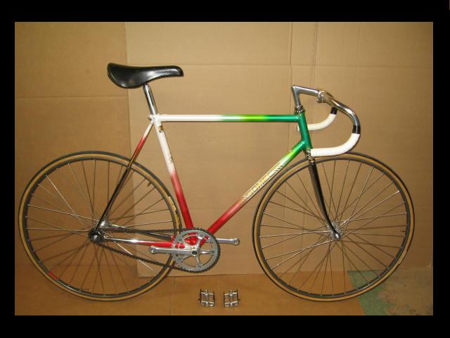
Track version of one of the Somecs on the last page.
-
• #165
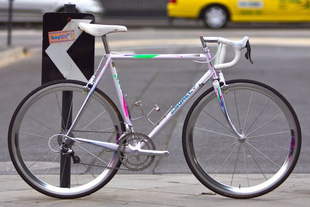
-
• #166
Everything toby.d posted is hella nice.
That Somec ^ is rad too.
-
• #167


-
• #168
Mmm...sprinkles.
-
• #169
euuuurgh, sprinkles
-
• #170
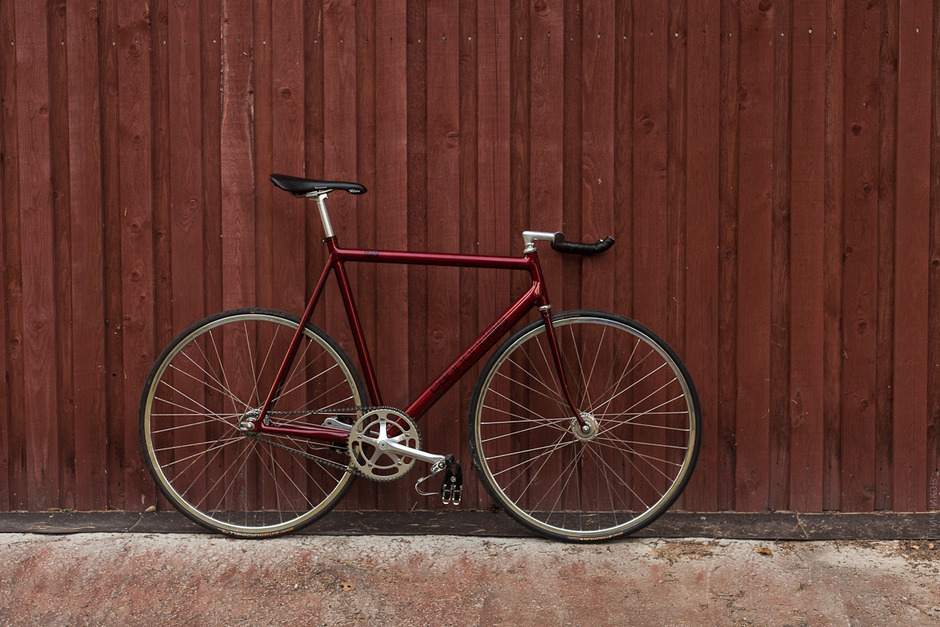
Plain I know, but such a gorgeous colour/finish.
-
• #171
that is nice! the fact its not blue with original (ish?) decals completes it
-
• #172
that is nice! the fact its not blue with original (ish?) decals completes it
-
• #173
what a shame he's put it against a similarly coloured background
don't these fixie skidders know about colour wheels ?
Plain I know, but such a gorgeous colour/finish.

-
• #174

poor somec living in a cardboard box
times are hard -
• #175
what a shame (s)he's put it against a similarly coloured background
don't these fixie skidders know about colour wheels ?Oooooh. That's what I liked the most about the picture - the color(s)! It's a classic photographic twist, to use only one color but in different nuances (note the bordeaux-ish concrete in the front). Loved it!
 hugo7
hugo7 1000archangels
 spotter
 Scilly.Suffolk
 toby.d
 Wrongcog
 wildstrawberries
 Verbs_&_Nouns
 Jec
Jec William.
 Aches
Aches dicki
dicki
Vaz.