What did the designers of that bunk find so distasteful about the colours of one of the most recognisable flags in the world?
Just like with the olympics logo itself, it's hard to imagine how they ended up where they did, given that it's almost impossible to make a bad start given the source material you have to work with.
All I see in that strip, is Deustche Bank:
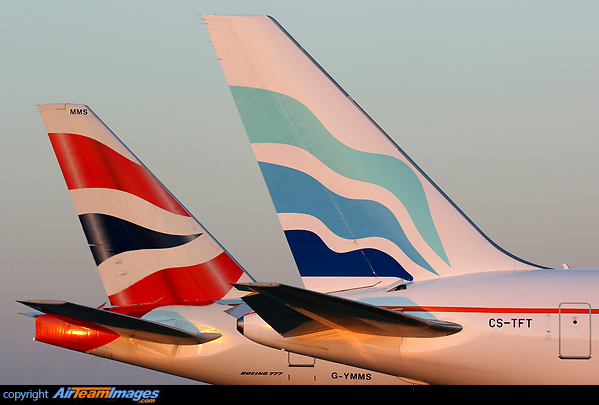
And both the British Airways and Euro Atlantic tail wings:
What a bank and some airliners have to do with a team of national athletes, I just do not know.
What did the designers of that bunk find so distasteful about the colours of one of the most recognisable flags in the world?
Just like with the olympics logo itself, it's hard to imagine how they ended up where they did, given that it's almost impossible to make a bad start given the source material you have to work with.
All I see in that strip, is Deustche Bank:

And both the British Airways and Euro Atlantic tail wings:

What a bank and some airliners have to do with a team of national athletes, I just do not know.