-
• #5202
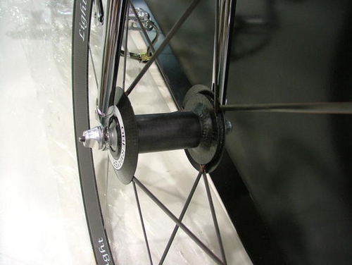
that lower lightweight fond is just plain cheasy
Is this the typography critics thread? I think plenty of companies, not just Don Walker and Carbonsports, get associated with a particular font before they are able or willing to really get good advice about typography, and thereby get placed in a somewhat invidious position; do you live with the carping, or do you change your branding and get a whole new group of people carping about your lack of respect for heritage, slavish fad-following, poor choice of rebranding etc etc. It's probably an even bigger problem for Carbonsports, as their "Lightweight" brand is such a generic term that the script ends up carrying a disproportionate load in the branding, compared with companies like Campagnolo, for example, where the name carries all the weight and they can write it in any script they want and still convey their own unique identity. Maybe Carbonsports/Lightweight should have called their product Obermeyer, and then made the high end version Obermeyer Lightweight, rather than the other way around.
-
• #5203
I'm not sure which of the Lightweight fonts eraserhead is criticising, but I have got to say I love this one;

Logo/font porn for me. -
• #5204
Very nice /\ /
They're making me a frame for the hill climb championships but the 'carbon sports' font is shocking (like a crap MS office font)
-
• #5205
just an add to your collection

they are just the same as normal ones they just say most lightweight ("Most" being pinarello's sub-brand)
-
• #5206
If they order a nice branding from a small creative group it will cost them something closed
to a pair of their wheels and their competitiveness will grow a 15% without risk...
I think that is the destiny of the most of small or independent manufacturers of nowadays,
they don't think their company profile as an weapon or something... -
• #5207
Actually while Lightweight's typography is awful, it's far more recognisable just for having that type - what other company in the world choose that type?
-
• #5208
why is it awful? i think it's fantastic.
-
• #5209
Actually while Lightweight's typography is awful, it's far more recognisable just for having that type - what other company in the world choose that type?
True, and it's mostly typography geeks who are annoyed by it, and how many of them are potential customers for a £3000 wheelset anyway?
-
• #5210
+1 to be fair though their standard wheels are quite understated.
http://www.cyclingtipsblog.com/wp-content/uploads/2009/03/lightweight.jpg
-
• #5211
They truly are astonishingly light. The first time I held one I was actually shocked at how a wheel could weigh that much.
-
• #5212
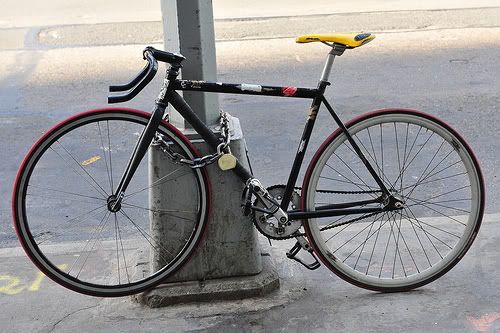
if I have money I wouldn't mind spending, I'd defintely love to own the Lightweight Fixie.

-
• #5213
Their disk wheel is on my xmas list but dunno if I could live with the paint job.

-
• #5214
Reminds me of a 48h polo/trick wheel in a way.
-
• #5215
reminds me of those skanky bmx low rider wheels:
144h ftw
http://www.ridelow.co.uk/images/large/wheel_39580_LRG.jpg -
• #5216
That's the type that first came to mind for me, couldn't for the life of me think of what to search tho.. :)
-
• #5217
They truly are astonishingly light. The first time I held one I was actually shocked at how a wheel could weigh that much.
+1
-
• #5218
That's the type that first came to mind for me, couldn't for the life of me think of what to search tho.. :)
a mate of mine ran a pair on his flatland bike for a long time with no trouble, stupidly heavy as i'm sure you can imagine. mad amounts of momentum on big swirly tricks tho but a fucker to true up when they go out.
pointless, flashy, unfit for purpose. perfect for fixie skidding ;) -
• #5219
thats some crazy wheel
-
• #5220
reminds me of those skanky bmx low rider wheels:
144h ftw
http://www.ridelow.co.uk/images/large/wheel_39580_LRG.jpg+1 Thats probably where they got their inspiration.
-
• #5221
a fucker to true up when they go out.
Given the amount of spokes, it would probably take a couple thousand years to build the wheel.
Don't even make me think about attempting to true one.
-
• #5223
...that doesn't horrify me as much as it probably should
-
• #5224

WHY!
-
• #5225
Eh? it's only the handlebar that look pretty stupid, but other than that it's fine.
 gbj_tester
 MaxC
MaxC QuickVit
 TheCrane
 doctor_john
 edscoble
 StandardPractice
 edmundro
 irish_mick
 Unbroken1
 EasyLandright
 @flickwg
that lower lightweight fond is just plain cheasy