-
• #2
No logos Shrek.
-
• #3
1 sec
-
• #4
I fixed it for you... don't break it again.
-
• #5
haha thanks
-
• #6
wich one?
-
• #7
first one by miles.. its got a nice mid 50's 'singing in the rain' feel to it..
-
• #8
B, imho.
But only because it will be more usable due to the shape of it.
The font is pretty bad though.
-
• #9
The both remind me of cereals.
Prefer 2nd (I think).
-
• #10
don't like the kerning on no2
1 is better but would prefer it to be not warped but still curved. -
• #11
Not too keen on A and B is a bit too 'Nestle'.
I'd go for B though.
-
• #12

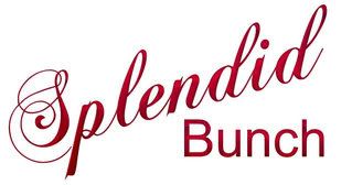
how about that?
-
• #13
sorry to be all 'designery' but what is that logotype for?
difficult to give you a fair assesment without knowing your audience/market
-
• #14
have the splendid curved
and a fill -
• #15
blog logo
-
• #17
personally, unless you're going to redraw that futura instead of just warping it…
you're one step away from having the type police called on ya :^]
-
• #18
A, but you need to make sure your backgrounds are all white (racist) on your blog first.
-
• #19
yikes, B for the love of God!
-
• #20
a
-
• #21
A is more appealing but the execution is a bit dizzying.
-
• #22
yeah A looks far better
-
• #23
haha A needs working on, but i think a mix of both..maybe the fill from B in A?
-
• #24
warped type always seems wrong - find a typeface that has the curve on it if you want that effect
-
• #25
sorry to be all 'designery' but what is that logotype for?
difficult to give you a fair assesment without knowing your audience/market
Your favorite. Chimps.
 _Zed_
_Zed_ SHEK
SHEK Velocio
 pifko
pifko pojo!
pojo! big_daddy_wayne
 hippy
hippy StandardPractice
 Bad_Matt
 jodie_harsh
 TheBrick(Tommy)
This has nothing to do with bikes but i need you opinion..
A?
or
B?