-
• #52
MrSmith it's 99% percent there, if it had drops it would be the shiz.
Exactly. I might even be tempted to jam this in my back wheel.
-
• #53
i like the tube theme nice work
reminds me of the great bear
-
• #54
good stuff - Not too keen on the undergroung logo on there - but I can live with that.... u got some nice geometry there.
There seems to be some real good ones. As we are going to print digitally (if it ever happens...) maybe we could think about having more than one winner???? Perhaps 4 - that's how many cards can go onto an A4 sheet if they are A6 sized.... Just a thought
-
• #55
One for each day of the week.. or if you're like some people.. each set of wheels..
-
• #56
No back as yet.

-
• #57
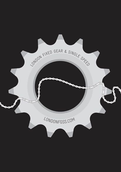
Is the chain in the shape of the Thames?
-
• #58
The pedant in me thinks that the comments should be in the 'discussion' thread - isn't this for designs only?
Just noticed that I've commented on here too... :o)
-
• #59
I think its ok to just use one thread. If that's the way people like using it then we'll leave it like that. No one's going to get booted for posting in the wrong thread - This is not that sort of forum ;-)
-
• #60
ok - happy either way!
Slamms is good, but Todds Testcard (with a couple of tweaks) gets my vote.I'm off to New York in July - if I could take a couple out there it would be cool!
-
• #61
rkn Is the chain in the shape of the Thames?
Yup.
-
• #62

-
• #63
i think jol's is very classy but i have to say that slamm's design is my favourite by a long way (i love the design of the tube map anyway so tha probably influences my decision.
-
• #64
slight tweaks made then…
- pretty subtle - made the underground logo a lockring.
- added some drops (maybe needs a bit more work?)

- pretty subtle - made the underground logo a lockring.
-
• #65
liking this
-
• #66
like the logo but i dont like the drops.... sorry! Maybe have just less drop on them? So it goes into the curve earlier?
-
• #67
rkn like the logo but i dont like the drops.... sorry! Maybe have just less drop on them? So it goes into the curve earlier?
yeah, I did it quick to see whether it would work. Think this is a bit better?

-
• #68
Slamm - nice work but why not a horizontal TT?
-
• #69
Momentum Slamm - nice work but why not a horizontal TT?
looks pretty straight to me :-P
-
• #70
Yeah slamm thats great!
-
• #71
any but the orange one... the only thing worse then bianci green!
-
• #72
slamm [quote]
looks pretty straight to me :-P
Me too - did you change it or have my eyes changed? I'm confused...
-
• #73
It looks wicked now anyway
-
• #74
Yo slamm, you da mann.
-
• #75
so are we gunna set a deadline for a decision?
 Build
Build dicki
dicki jonaent_(Jon)
 hippy
hippy JOL
JOL runcible_rakan
 salmonchild
 slamm
slamm 31trum
 chris_crash
 lpg
lpg
LIKE IT! :-D