You are reading a single comment by @Sumo and its replies.
Click here to read the full conversation.
-
Yeah, that's what I noticed. Even Ive noticed. Sorry @Regal, I know how much it hurts you
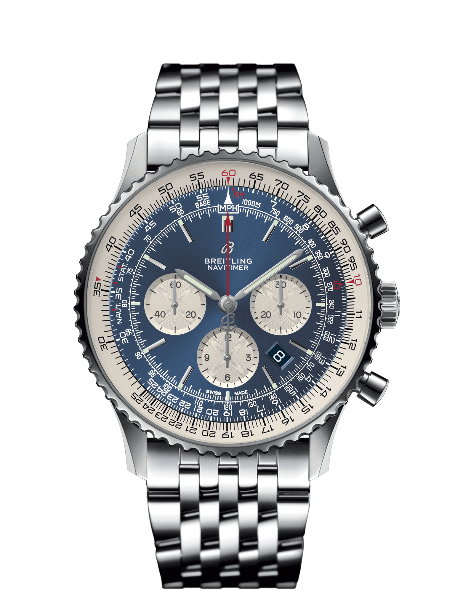
Here's a breitling to cheer you up

Yeah, that's what I noticed. Even Ive noticed. Sorry @Regal, I know how much it hurts you
Here's a breitling to cheer you up

For a novice what's the issue? The fact that it looks like a weak Explorer rip-off or something else?