You are reading a single comment by @Regal and its replies.
Click here to read the full conversation.
-
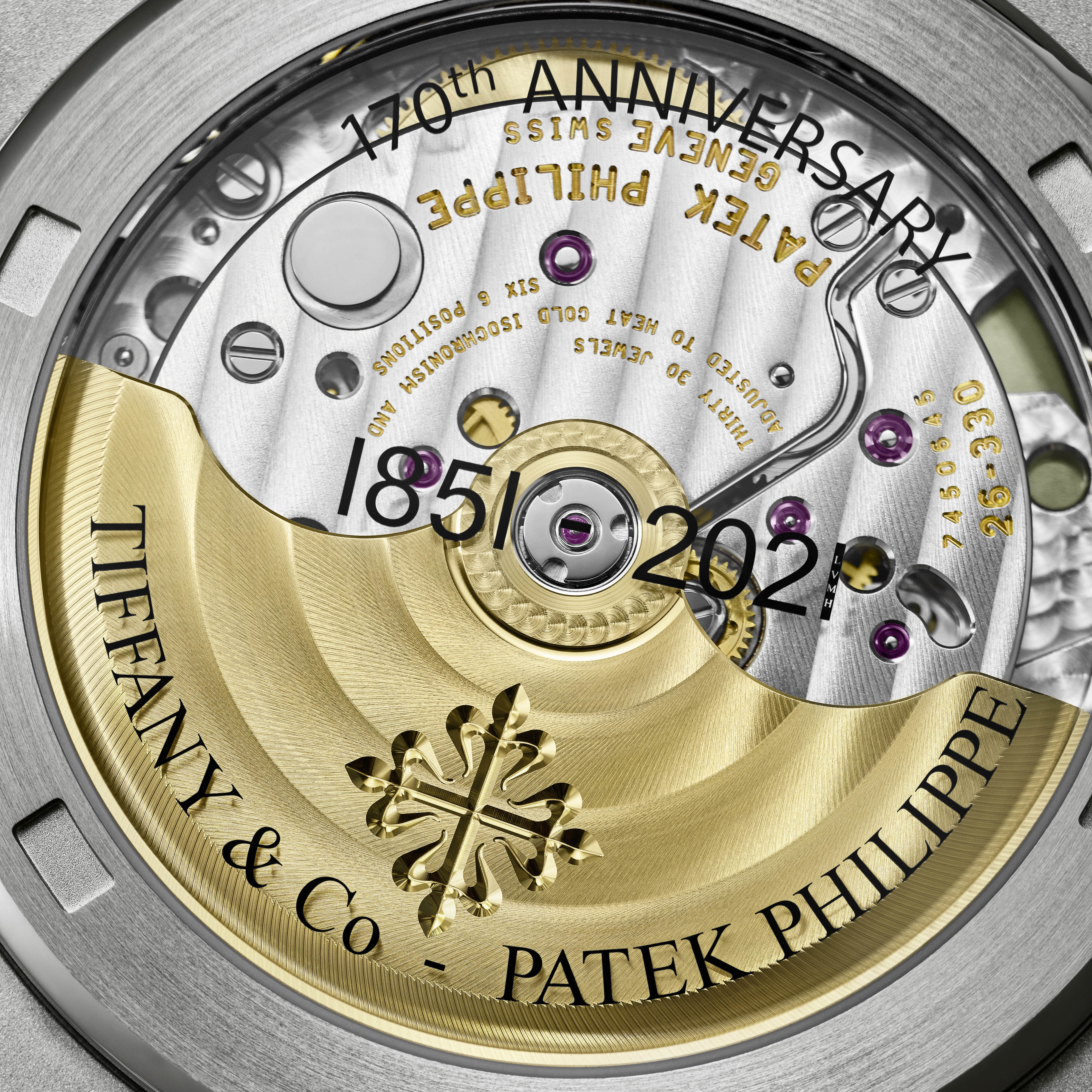
Omega are far better than that - they'd never produce this kind of system font shitshow. Writing "Tiffany & Co" in Times New Roman, leaving the period off "Co." and using a hyphen for a dash - they're clearly still employing the person who thought Arial was an appropriate choice for the word "Tourbillon".

 Regal
Regal AlexD
AlexD D-Dog
D-Dog swedeee
 rj
rj
Haaa 😂
@Regal Bamford at the front, Omega limited edition at the back. Think it's because it's so matt compared to most other variants other than the white version.