-
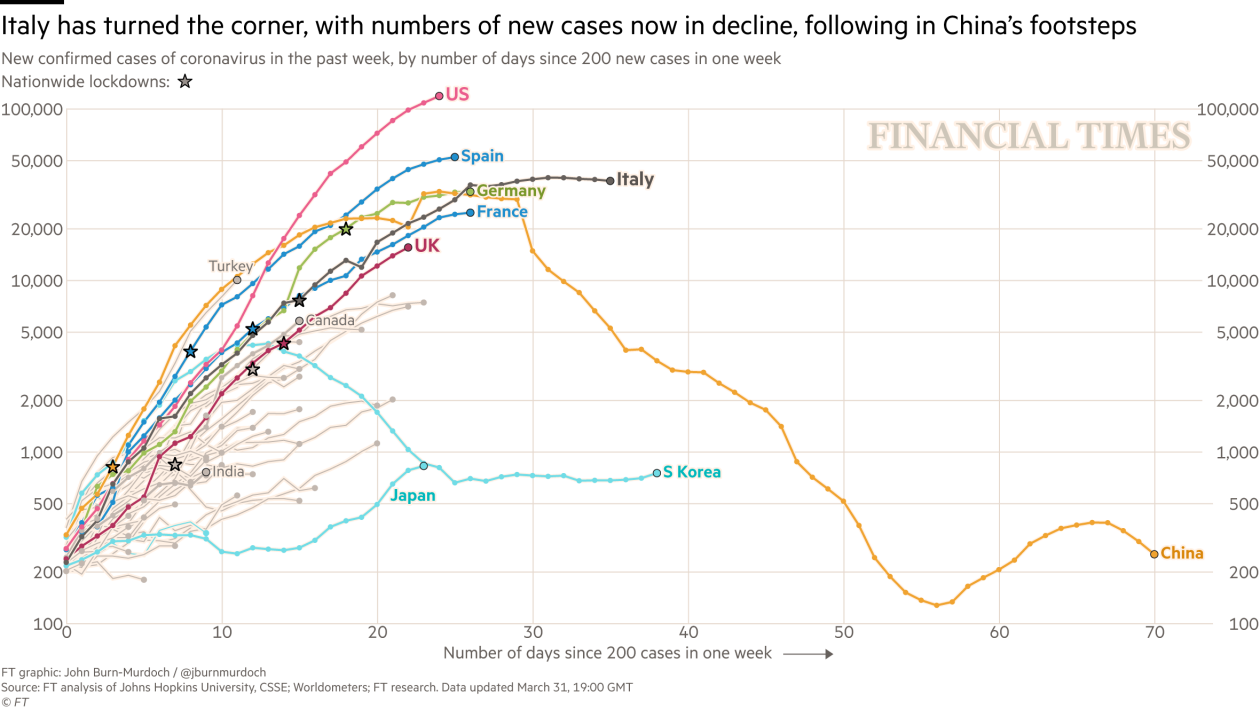
How are they testing in Spain though, and how much? I'd be very careful with getting any conclusions at all from the case numbers - I think, if anything the death numbers in the second table are more 'solid' in that sense. Also, they don't mention basing their calculation on some kind of running average (unless I missed it?), so while the decrease in speed is of course great to see, the numbers would be a lot more dependable if they weren't exposed to the types of random ups and downs (noise) in the daily data.
You are reading a single comment by @beseku and its replies.
Click here to read the full conversation.

 SwissChap
 @beseku
Something I'm finding interesting to follow isn't the count of cases, but rather the day to dayincrease or decreases. In this article, (sorry, in Spanish), the second and third infographics show the rate (as a ratio) that the cases and deaths are growing relative to 3 days ago.
The Guardian, for example, call out that the no. of deaths yesterday was the highest yet, but for the last 3-4 days, almost every community in Spain has recorded decreasing ratios, so the curve is flattening.