You are reading a single comment by @Acliff and its replies.
Click here to read the full conversation.
-
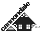
The typeface is the same one as this classic logo, although a bit cleaned up, lightened and respaced:
 .
.One of the problems with is it is that the curved letters like 'c' appear undersized. Generally the bowls would extend below the baseline to give the appearance of equal size. https://en.m.wikipedia.org/wiki/Overshoot_(typography)
 chez_jay
Ex National Champ's Super-X, for @youramericanlover