-
• #38502
That is lovely, but 'Herschel'... 🤦♂️
-
• #38503
Fortunately as a non-graphic designer, I do not care about such nuances :-)
Thanks for the kind words everyone.
-
• #38504
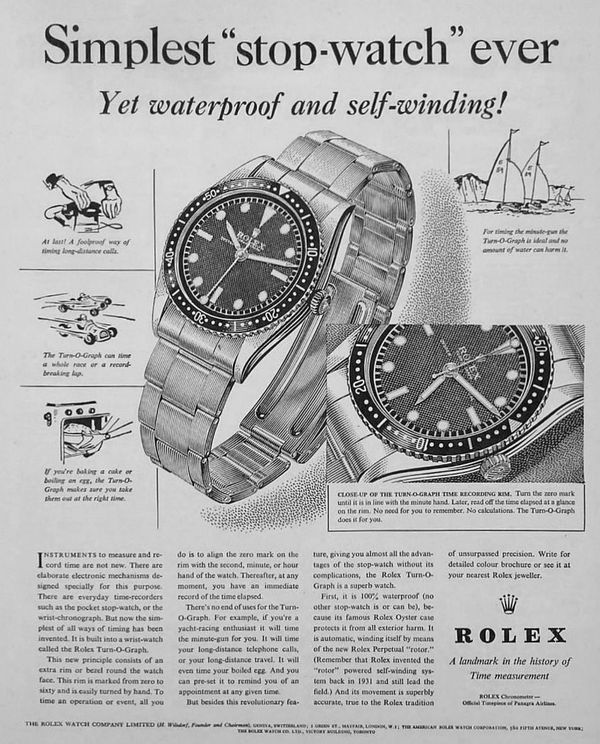
In other news, was on the subway this morning and clocked a guys scratched to shit, what looked like a Sub, but it wasn't a Sub I'd ever seen. Anyway, the internet leads me to the Rolex 6202. From 1953. And he was just wearing it casually on it's incredibly stretched riveted Oyster bracelet to work which was great to see:

Also came across this great ad:

-
• #38505
That line through the Longines is such a shame. How did someone look at that and go "Yup". Not wild about the cut-off 6 too. That little bit of font on the left that stops it being a circle would drive me potty. Other than that it is nice - definite hint of the Master Control about it.
-
• #38506
I wasn't really feeling the renders but that looks way better on the wrist. The texture to the dial really sets the rest of the watch off.
-
• #38507
Also, in case @Dramatic_Hammer is still looking for a sporty GMT under £2k, this Muhle Seebataillon GMT is on Drop at the mo for $1,999. There's import tax to pay but think it would still come in under £2k:
https://drop.com/buy/m-hle-glash-tte-seebataillon-gmt-automatic-watchEDIT: I got a bit excited about this but actually you can get it off Chrono24 for sub £2k so ignore!
-
• #38508
Ordered me a UV torch for fancy lume shots. Hopefully be here for next week's Wristy Friday
-
• #38509
Some sort of Halloween lume off??
-
• #38510
That and looking for, er, organic stains.
-
• #38511
Ha, won't be taking to any hotels, that's for sure!
I have a couple of alternative movie posters with GITD layers, so will be nice to see them in all their glory
-
• #38512
Just read the Monochrome piece and it’s the same on the original! Kudos for accuracy, thumbs down to whoever draughted the original design in the 1930s.
-
• #38514
This is my watch strap. It attaches via a little nipple going in to one of the three attached holes.
I currently wear it on the loosest hole but it's just a little too loose. The middle one is just too tight.
Can anyone think of any way of adjusting this? Have thought about cutting between the holes and then trying to adjust where it sits manually.
Equally I could put something inside the strap so that the loosest hole would become tighter - ie a shim for my wrist.
Does that make any sense?
1 Attachment
-
• #38515
Yeah I mean “all” they had to do was copy the W10 exactly and they’ve pretty much done that. The “Mechanical” text is the only blooper (it’s in Helvetica, anything on a watch of that era would have been hand-drawn).
Are you certain it is in Helvetica? It looks similar, but not 100%.
-
• #38516
Wear it a little too tight for a while and it will stretch to your wrist. I’ve done it with much thicker bridle leather straps.
-
• #38517
Fairly sure. The opaque ink transfer printing (possibly screen printing) makes it look a bit softer (eg edges more rounded) than the digital font. But the shapes are right. It might be Akzidenz Grotesk as the C is very round.
In any case, whether it’s Arial, Helvetica or Akzidenz those “grot” letterforms weren’t used on watch dials in the 1930s. They were metal printing types. The transfer printing used on watches was generally rendered by hand.
-
• #38518

-
• #38519
Something about that doesn’t quite look right
-
• #38520
Wish they’d done the Roman numerals in the minute track as well.
-
• #38521
The more I look at it the more I like it. As a design I think it’s better executed than the JLC sector dial Master Control. Suspect 38.5mm might be a bit big for it though. Will keep an eye out for one in the Longines boutique near work.
-
• #38522
Today I am wearing a 2 tone Citizen eagle7
1 Attachment
-
• #38523
This is pure win.
Who wouldn't want a real one? I mean, yeah, you'd have to be a bit of a knob to explain to people that your super-gauche rolly ironically includes a bespoke meme. But still. I definitely want one.
-
• #38524
Antique style military must now be a thing. After @JB 's watch now this

https://www.steinhartwatches.de/en/flieger-watch/nav-b-uhr-42-handaufzug-bronze-antik-schwarz.html -
• #38525
"part of the equipment of every navigation officer serving in a German Air Force crew during World War II."
Think they spelt Nazi wrong
 JB
JB Detritus
 DethBeard
 D-Dog
D-Dog Stonehedge
 Regal
Regal inchpincher
 Jaaamie
 TRA
TRA drøn
drøn Heldring
 hugo7
hugo7 Aroogah
 fredtc
 @coppiThat
That is lovely but the type bothers me...