-
• #977
noice
-
• #978
That's nice
-
• #979
Awesome
-
• #980
Just perfect.
-
• #981
Looks great. Paint the pump!
-
• #982
Pump matches the silver of the racks so I'll leave it. Hopefully will get built on Thursday, went to see my new rack today, thankfully my Big Top rando bag first perfectly on it!
I wasn't going to make new decals for it, but having been to see a John Carpenter film tonight I suddenly feel the urge to get some white ones made in the Albertus typeface.

-
• #983
Who's building the new rack?
Don't worry I scrolled back and found out. -
• #984
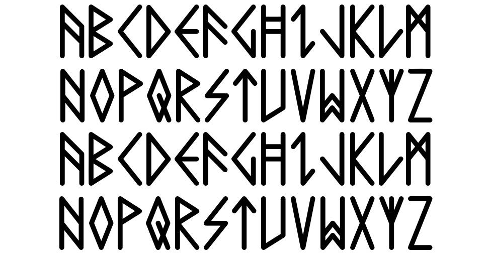
Might actually go for some kind of norse font

-
• #985
Much more fun
-
• #986
I could also get Phil Collins as a head tube badge....
-
• #987
I think the Albertus looks better, more classic. Norse feels a bit try hard?
Obviously I also approve the sentiment of the Albertus sample.
-
• #988
Go with Genesis own font. Anything else is def trying too hard.
White decals and brazz head badge will pull nicely away from the surly look.
Then years down the road, when the bike regained it's scars you'll have the bike you dream of -
• #989
I agree on the head tube, but I've never really liked their typeface it's too heavyweight for me. I might go for nothing.
-
• #990
What is this, a bike for hobbits?
-
• #991
What will the decals say?
-
• #992
Just Genesis probably
-
• #993
Norse fonts remind me of the Rawland stuff.
Dig the John Carpenter font.
-
• #994
Not tempted to get something mor exotic?
-
• #995
feeling the norse typeface, have you seen this, came out fairly recently.. it's a bit simpler.

-
• #996
Just Genesis probably
Which one?!

I'd have to go with the clean lines of the font used on the Hipgnosis-designed Lamb Lies Down on Broadway cover, myself.

-
• #997

clearly, or

-
• #998
Obvi

-
• #999
Ah I knew someone else had a norse font, couldnt remember who!
-
• #1000
Like what?
 Kidneys
 dangeek
 tyeness
 jontea
 spotter
 Fox
Fox Hulsroy
 rodan
rodan TM
TM Verbs_&_Nouns
 JT
JT fredtc
A little hard to photograph, it's darker than it looks in the first photo.
And sort of a semi-gloss/matt finish